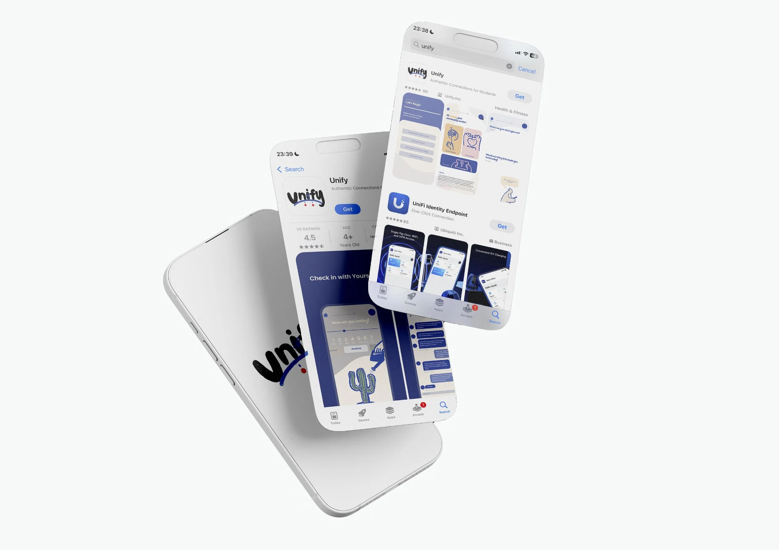
Unify targets young University students who do feel isolated and lonely.
Aims to foster genuine connection and belonging for them by encouraging mindful digital interactions, emotional check-ins, supportive peer-to-peer engagement and the best-shared activities with the ones you belong with. By prioritising well-being and authenticity, the app creates a safe space for students to be heard, feel understood and build real connections that go beyond the screen.
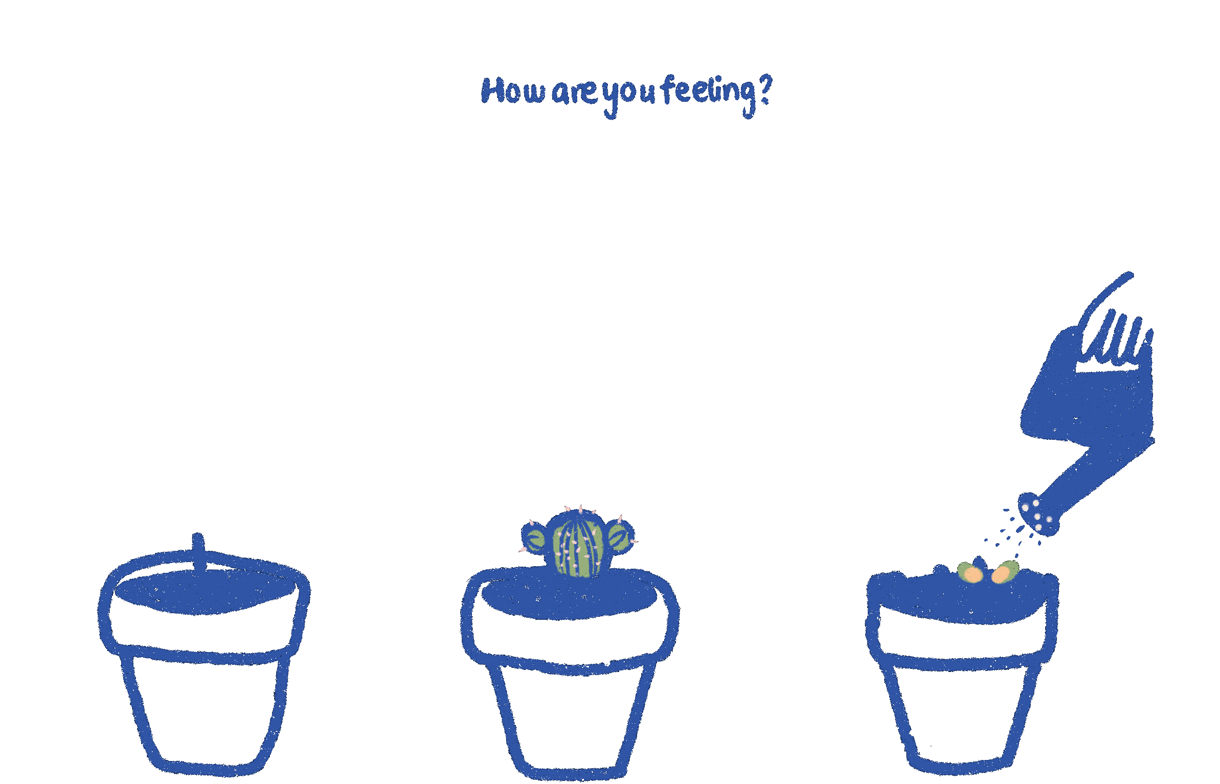
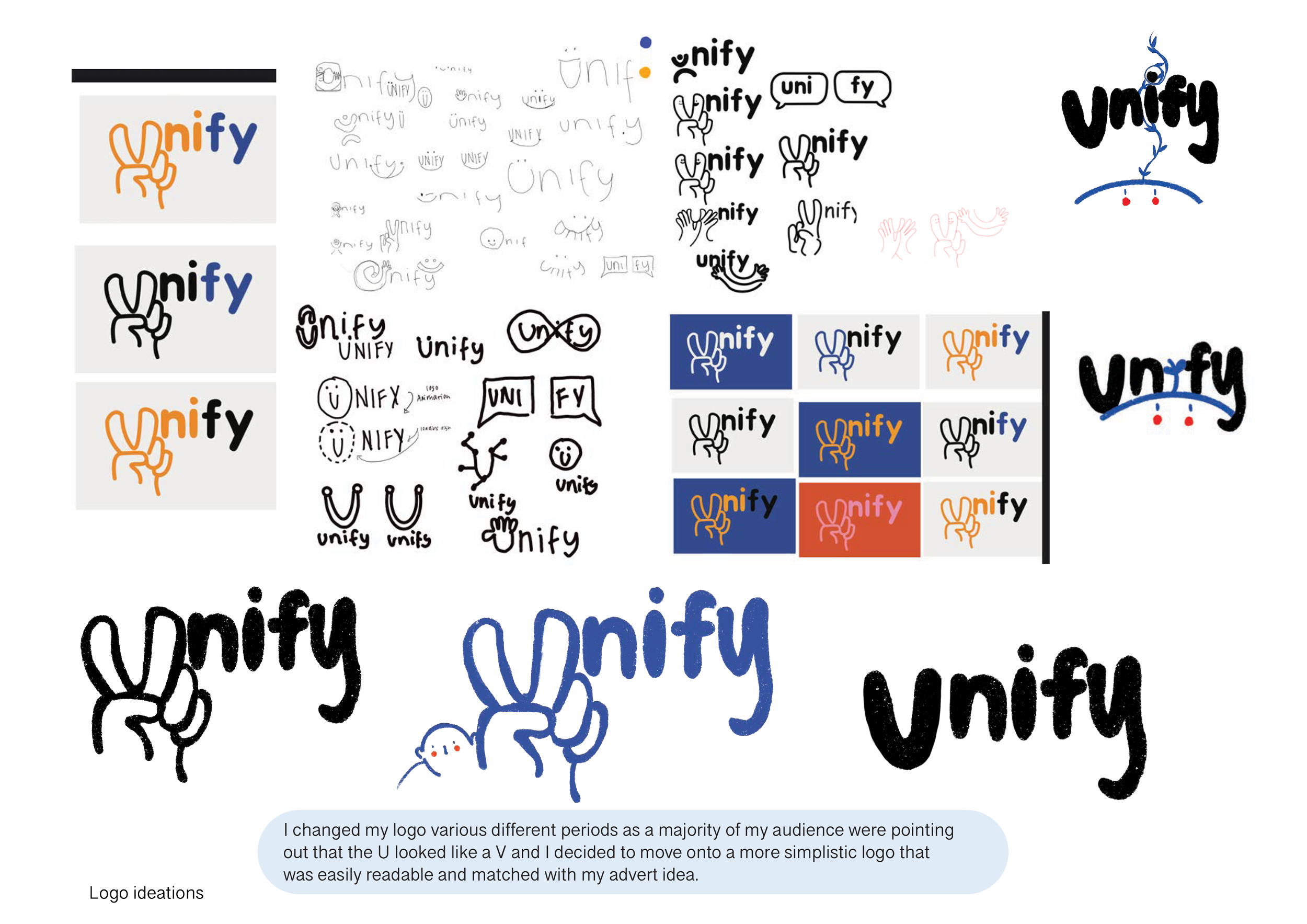
The brand and app is hand-drawn to portray authenticity and build a sense of trust, friendliness, softness and understanding. The character is a mascot it is designed to be genderless and androgynous to make sure it resonates with the diverse audience . The leaf growing on it’s head serves as a visual metaphor for personal growth, hope and transformation. It symbolises that even in moments of loneliness and isolation there is a potential for connection renewal and flourishing
There are plenty of cliches of isolation and loneliness that are seen in other brands. A lot of brands rely on sad faces, empty chairs etc. This app re-imagines isolation as an opportunity for growth and self-discovery through the mascots journey, design elements and organic imagery. I avoided dramatic imagery and instead focused on hope, authenticity and community.