Client
Sachin
Year
16/10/2025
Project Overview
An online career development platform designed to help recent graduates transition from education to employment with confidence and clarity. The client wanted for me to work on the brands message, colour palette, visual metaphor, logo, visuals and wireframes. The brands core mission was to elevate graduates towards their professional goal.
The client wanted a platform that was motivational, modern and human combining the excitement of graduation with the empowerment of career growth. My role was developing the brand identity alongside another Designer, website design, UI wireframes and the animation storyboarding for the micro celebrations . As well as collaborating with web developers, animator and a graphic designer.
Meaning of Concept
From Graduation to Elevation means the journey of growth, self discovery and the feeling and experiences graduates experience after leaving university. The brand is built through the idea of climbing your personal mountain, representing the progress of getting your career and the resilience mentally you must have to do so. Every visual element was designed to reflect upon this metaphor from upward shapes and gradients to the motivational tone and visuals such as from base camp to the mountain to the clouds
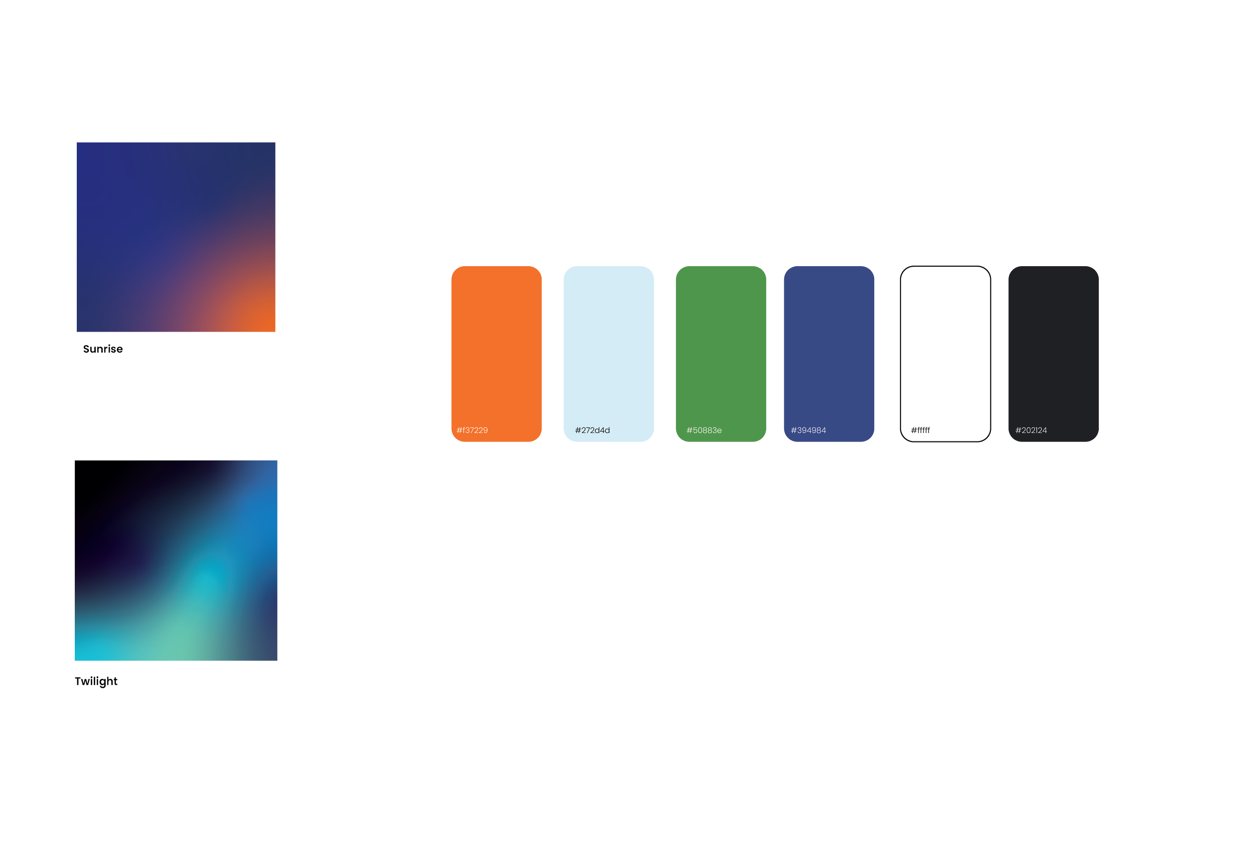
Colour palette
These colour palettes were chosen to mean optimism, progress and balance. Each colour palette having its meaning all the colours as a whole represent and evoke this feeling of sunrise over a mountain peak focusing on the start of a new chapter for graduates.
Typography
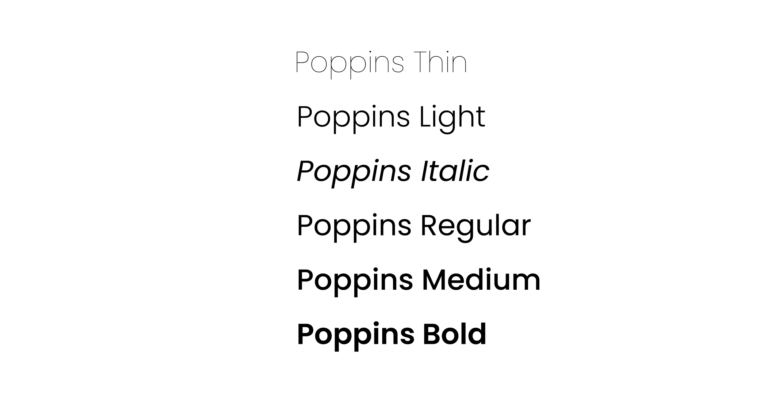
The primary typeface Poppins was chosen as it was clean and versatile as well as matched the brands identity better. Each weight or style was used strategically to ensure there was a nice flow to the website the different balances were chosen to reflect that professional clarity and youthful energy, something approachable, timeless and aspirational.
Logo Design
The client approached me to design a logo and brand identity for Elev8Grads an online learning and coaching program for graduates. The goal was to create a modern, uplifting and motivational brand that resonates with Gen z learners.
The logo was inspired by the journey graduates take as they transition into their careers, sort of like a climb that represents growth, resilience and self discovery. By exploring metaphors linked to mountains, sunrise and personal elevation, the identity visually captures the brands mission to help graduates reach their peak potential through mindset, coaching and learning.
Alternative logos
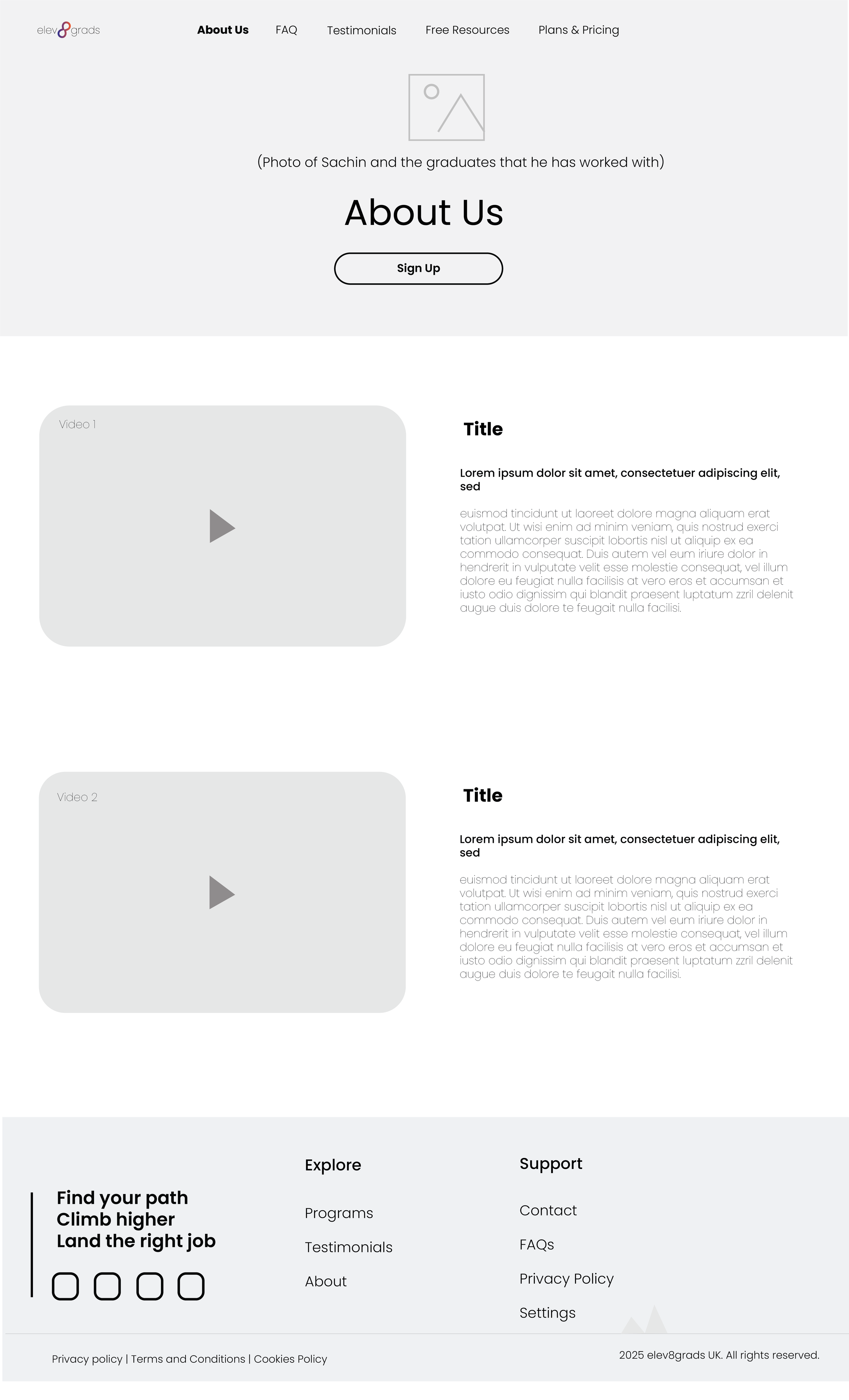
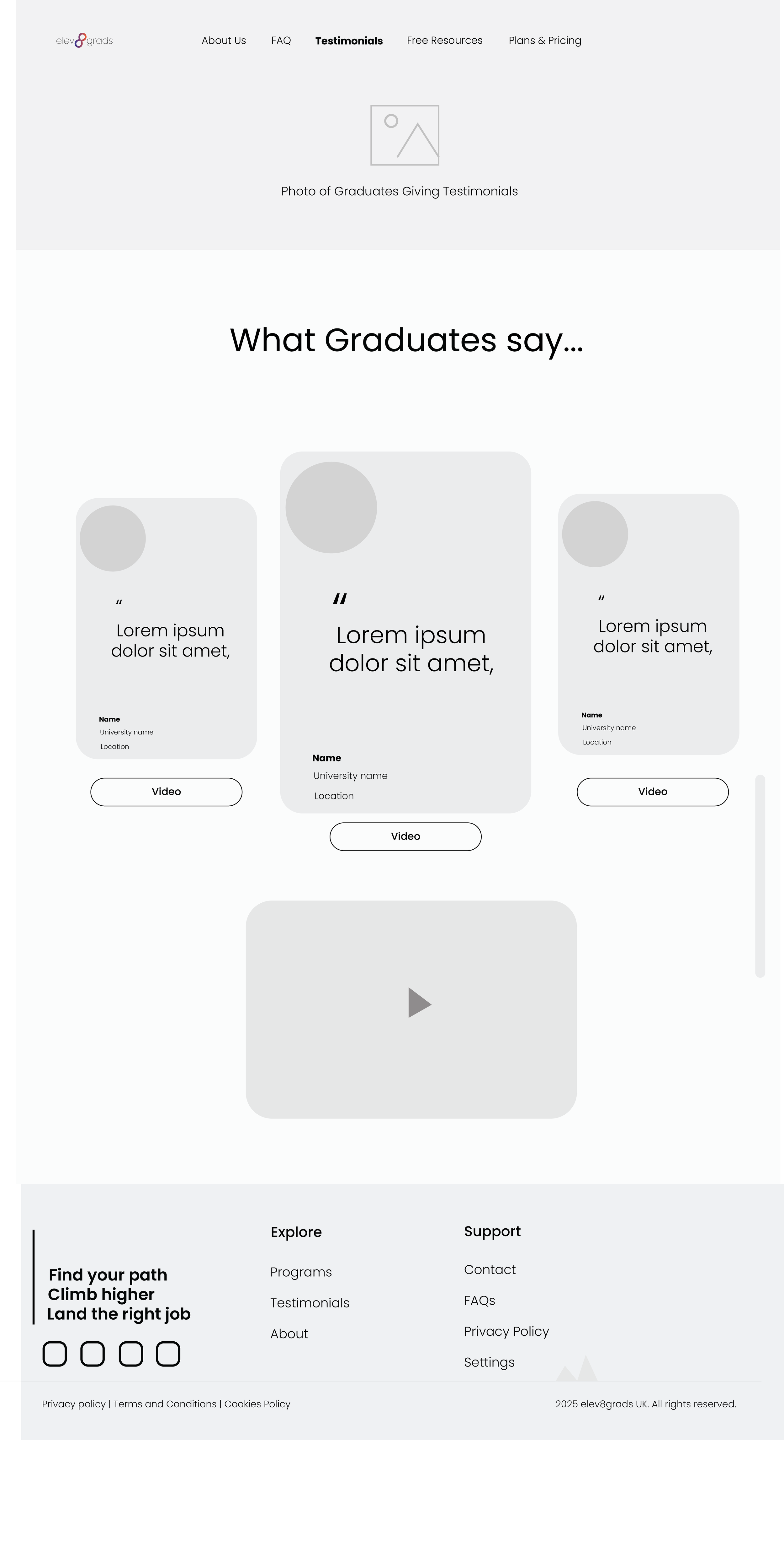
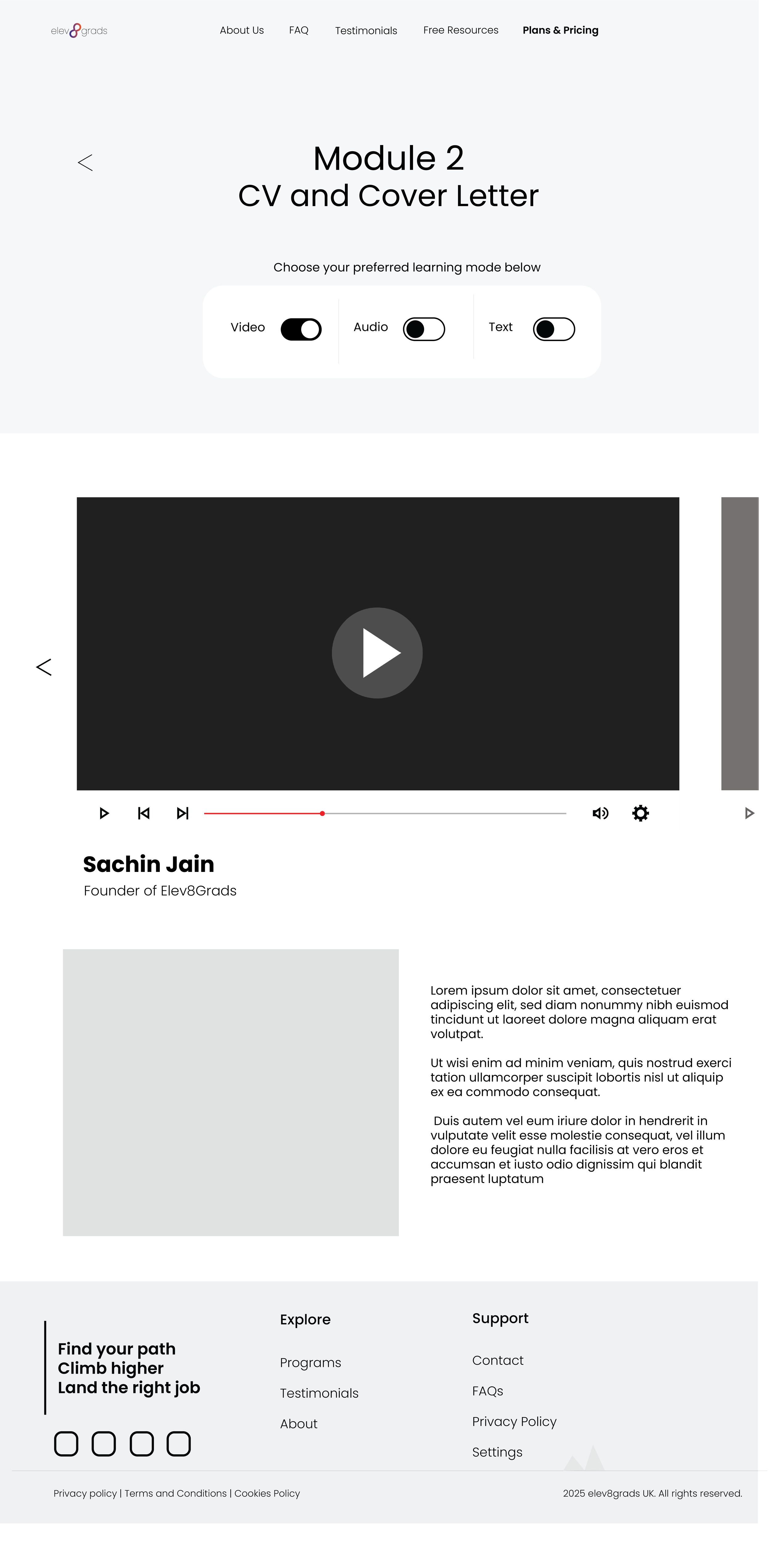
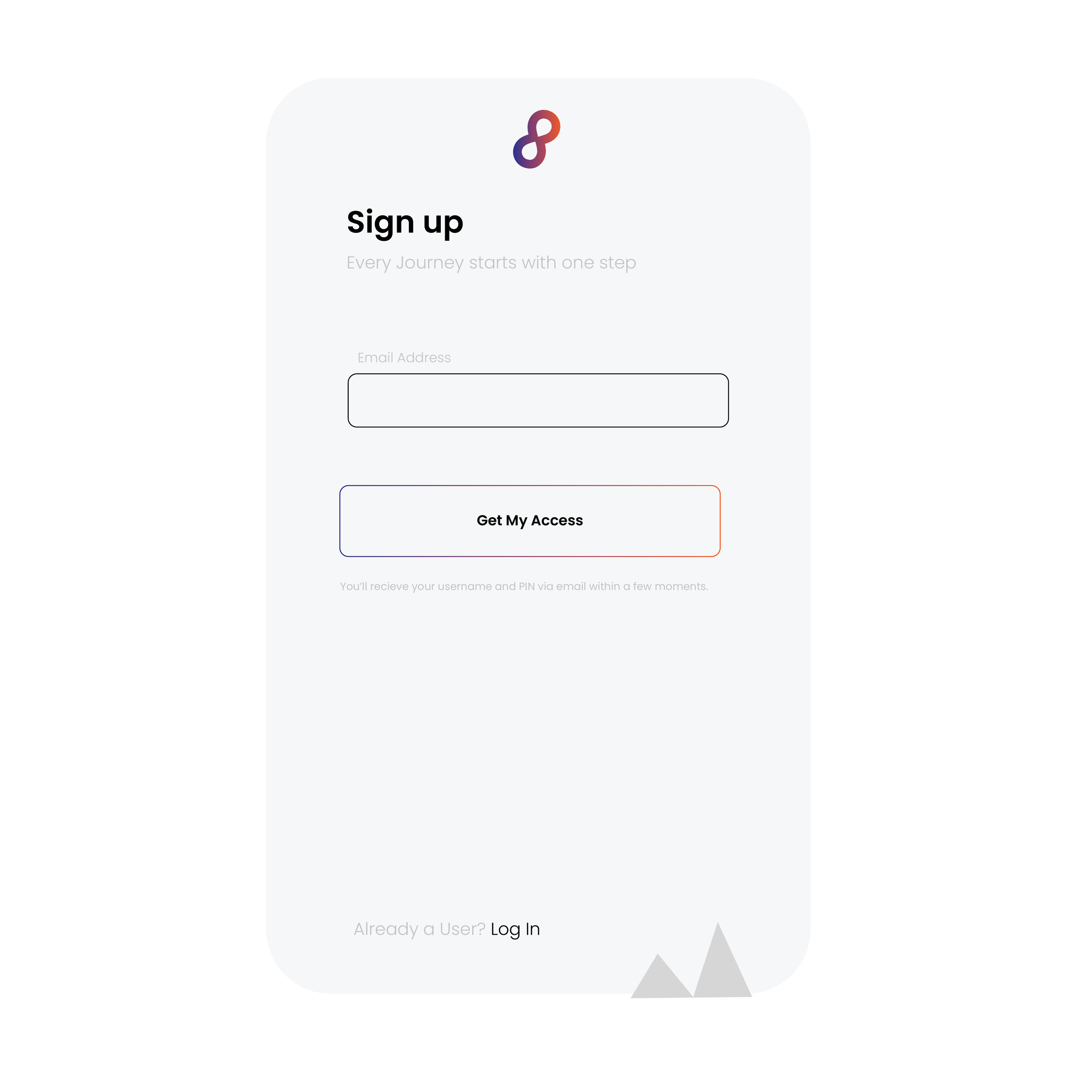
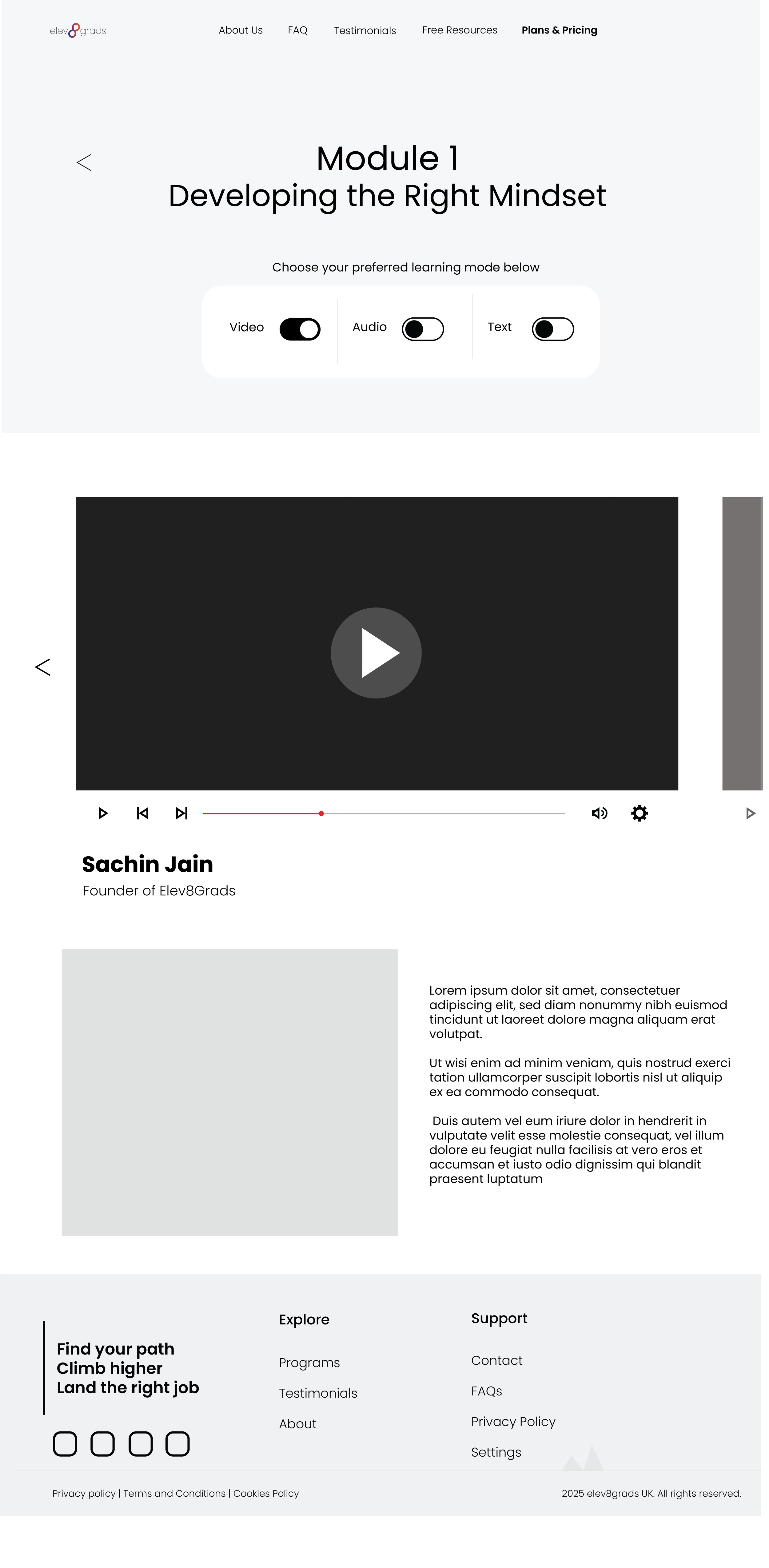
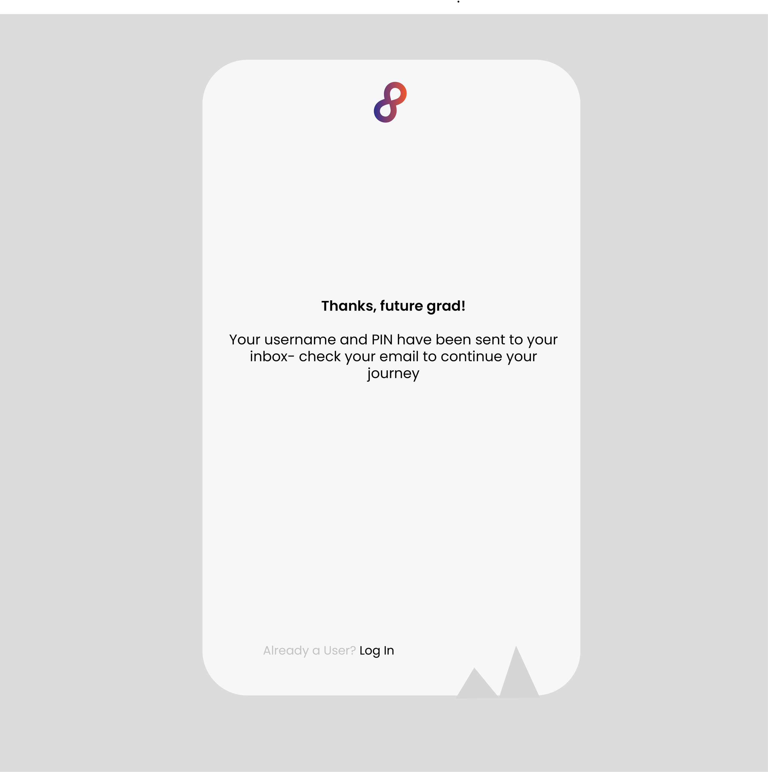
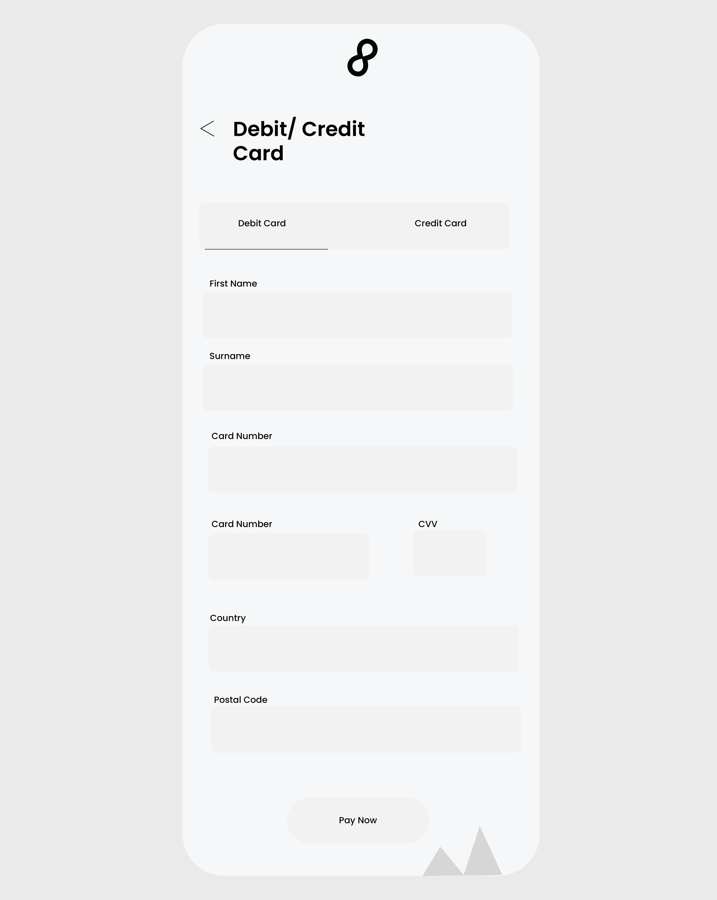
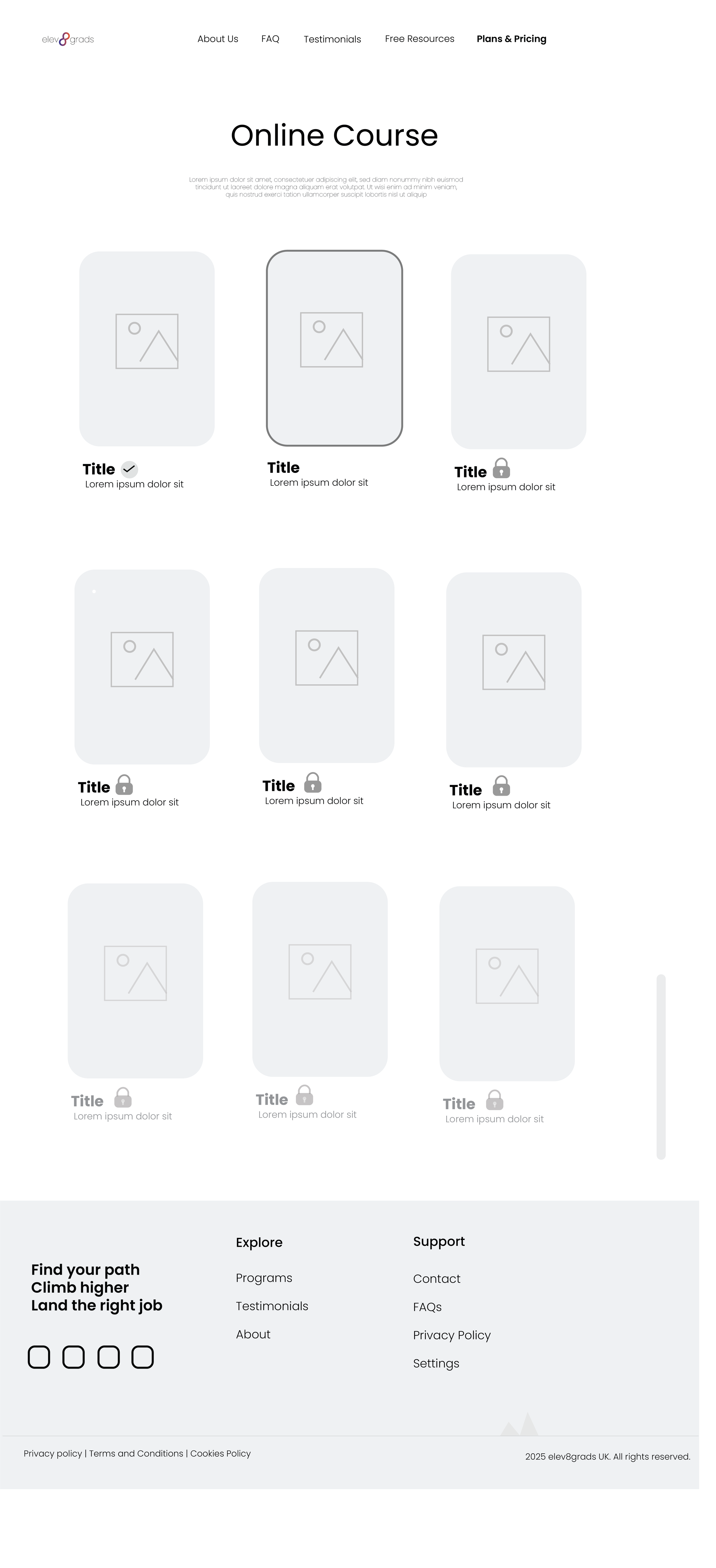
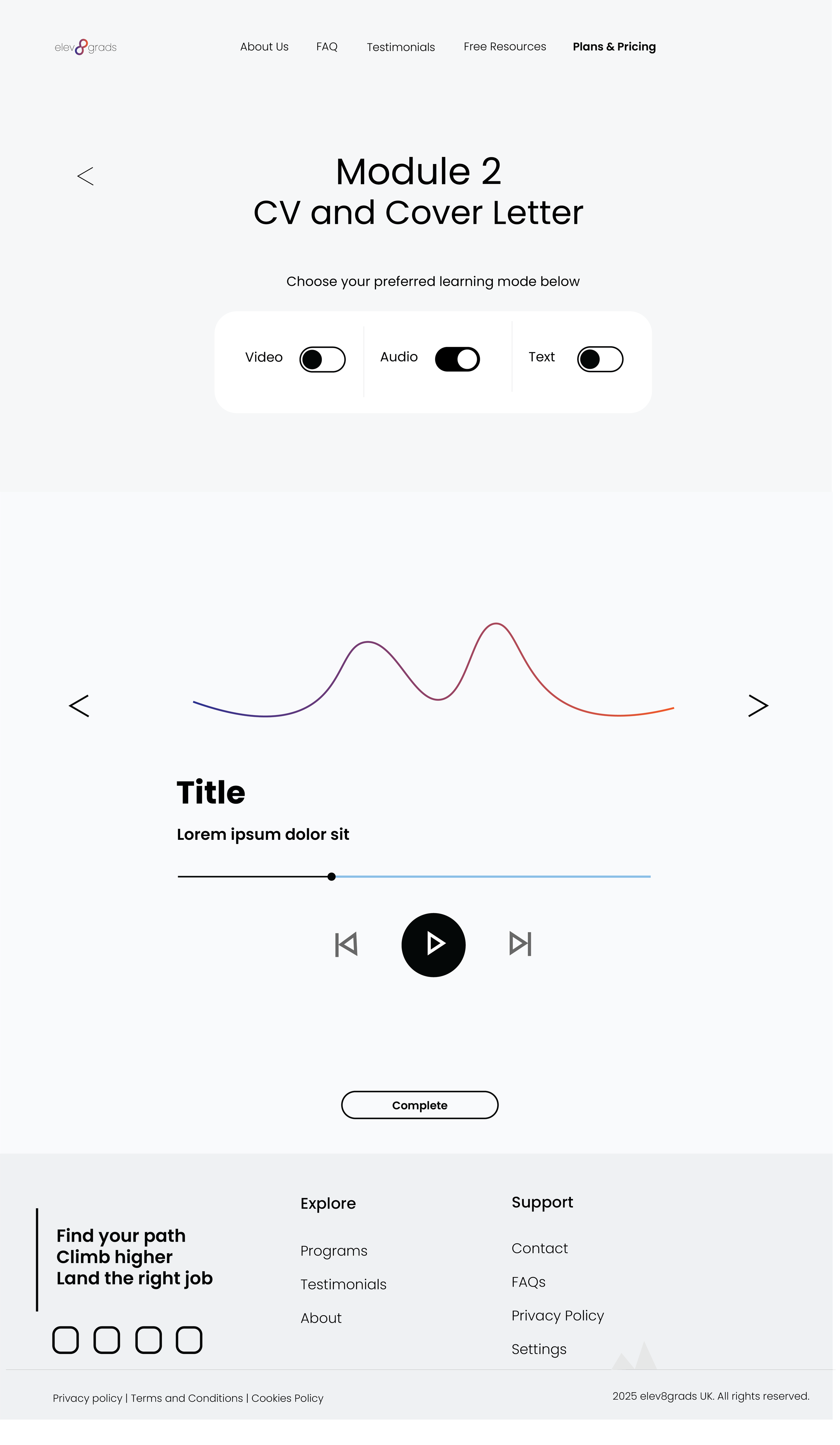
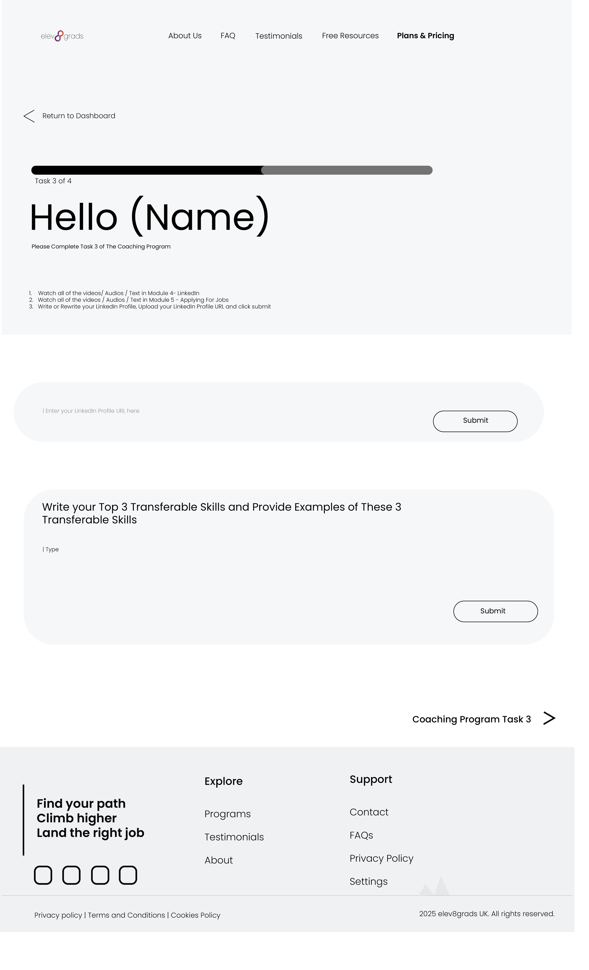
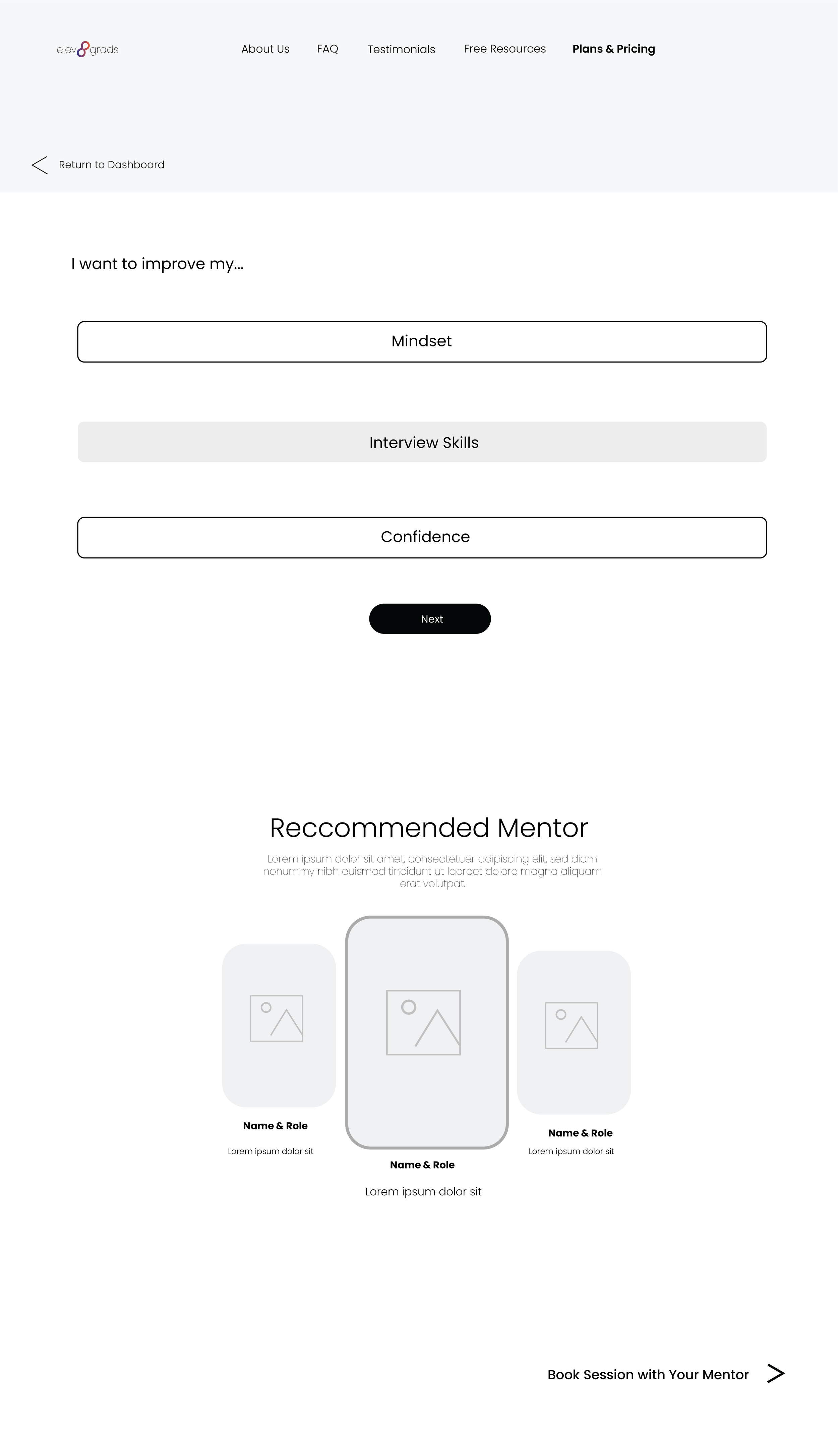
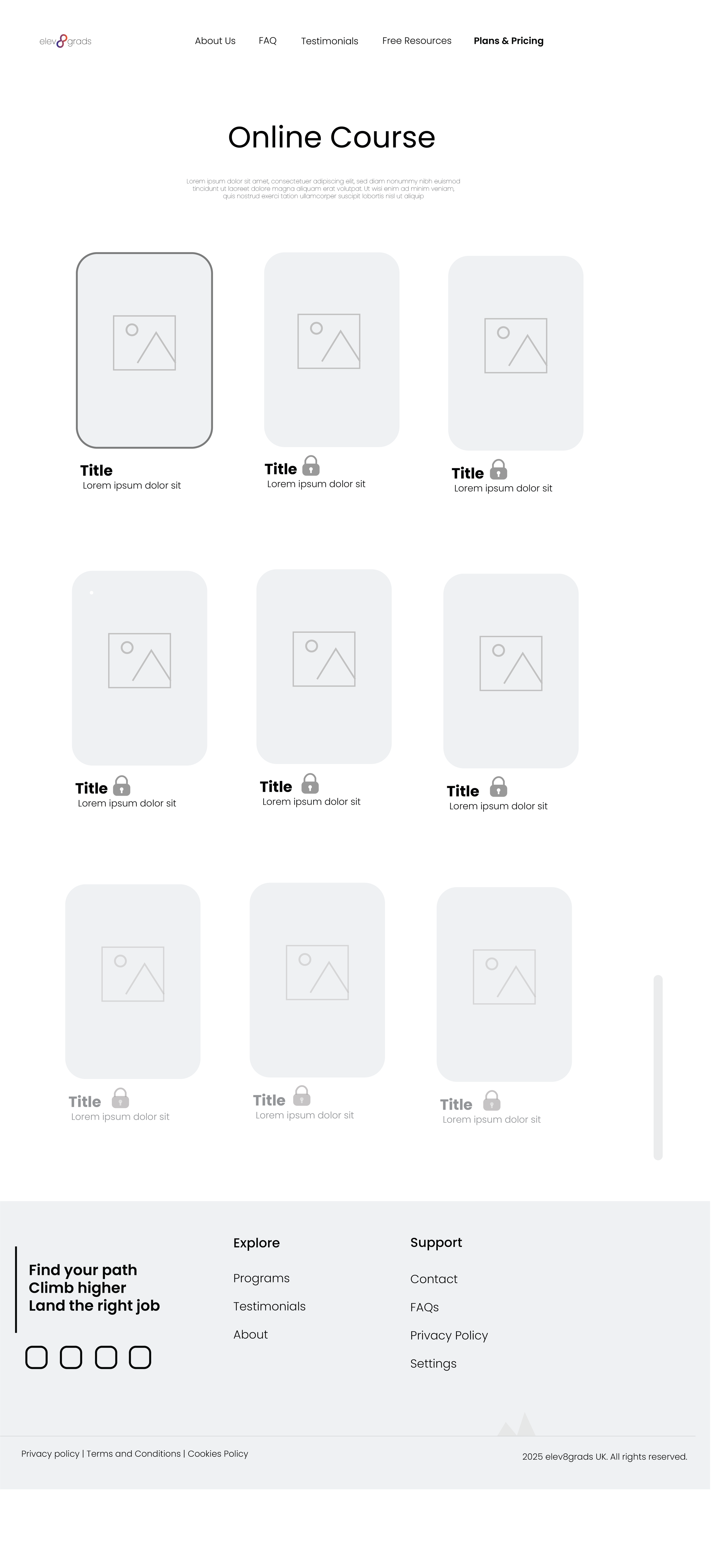
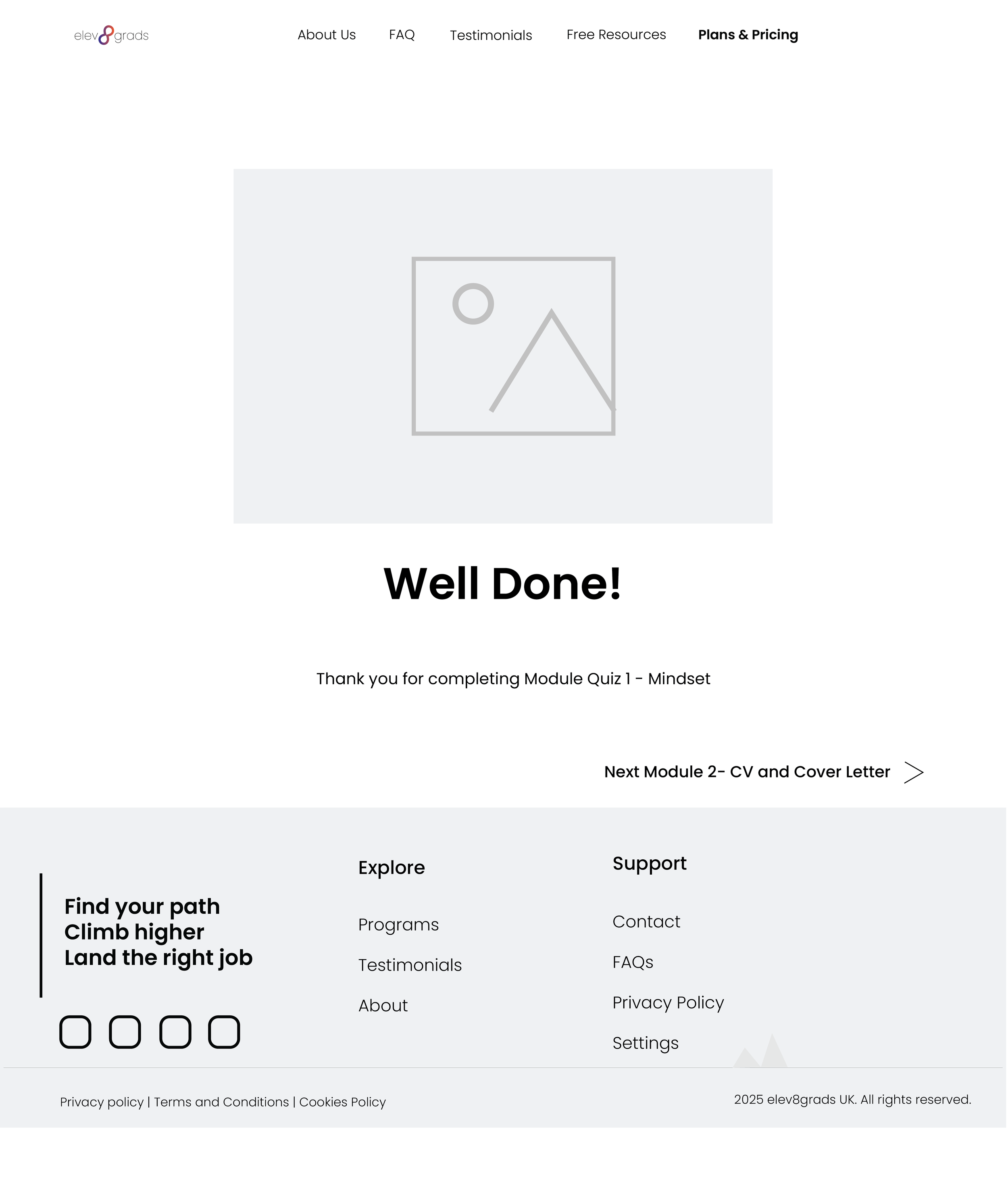
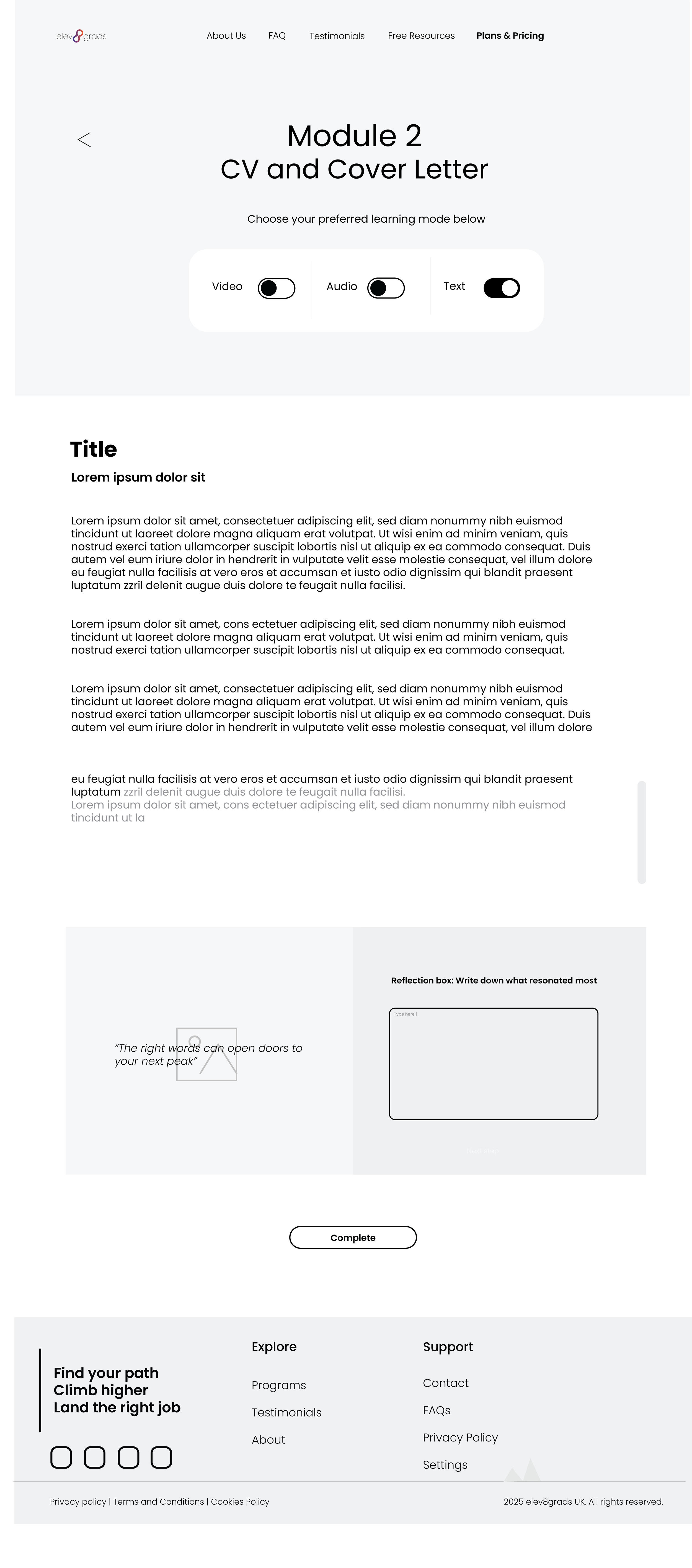
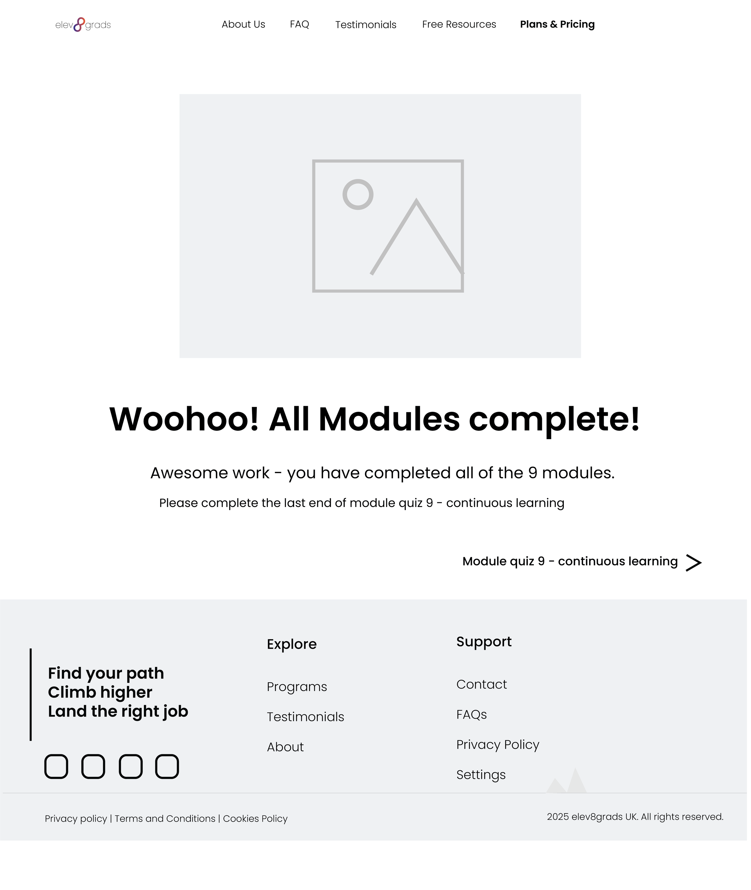
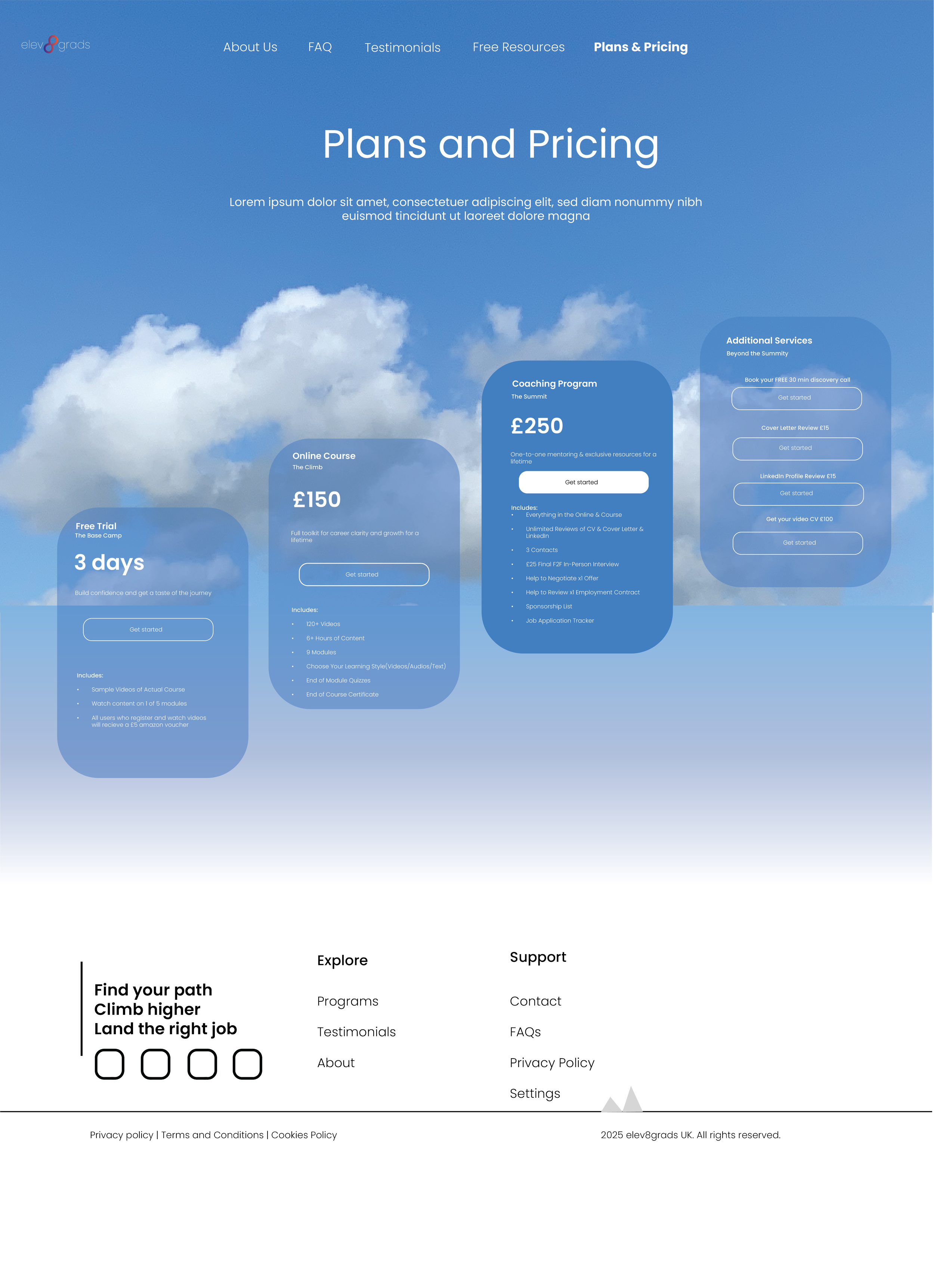
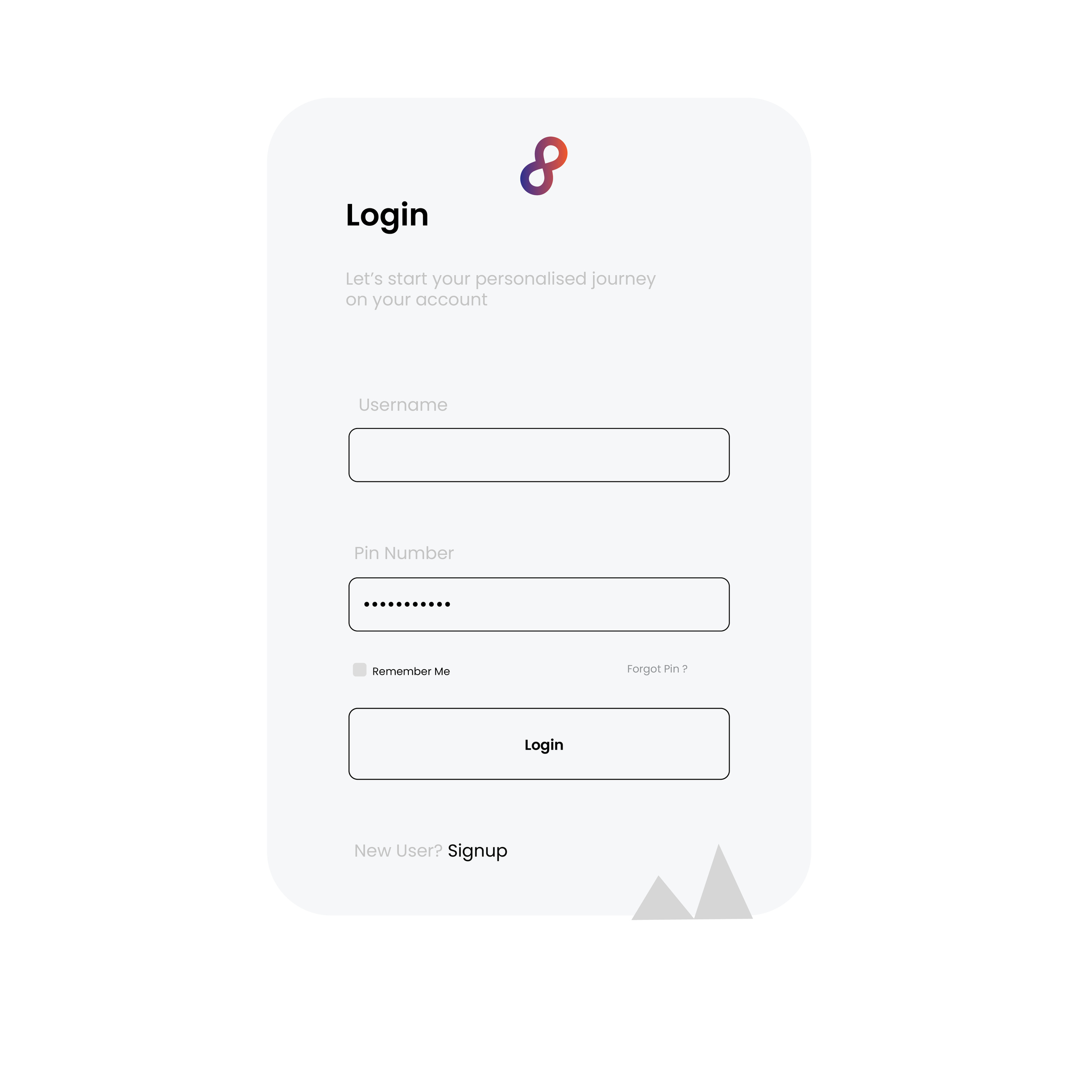
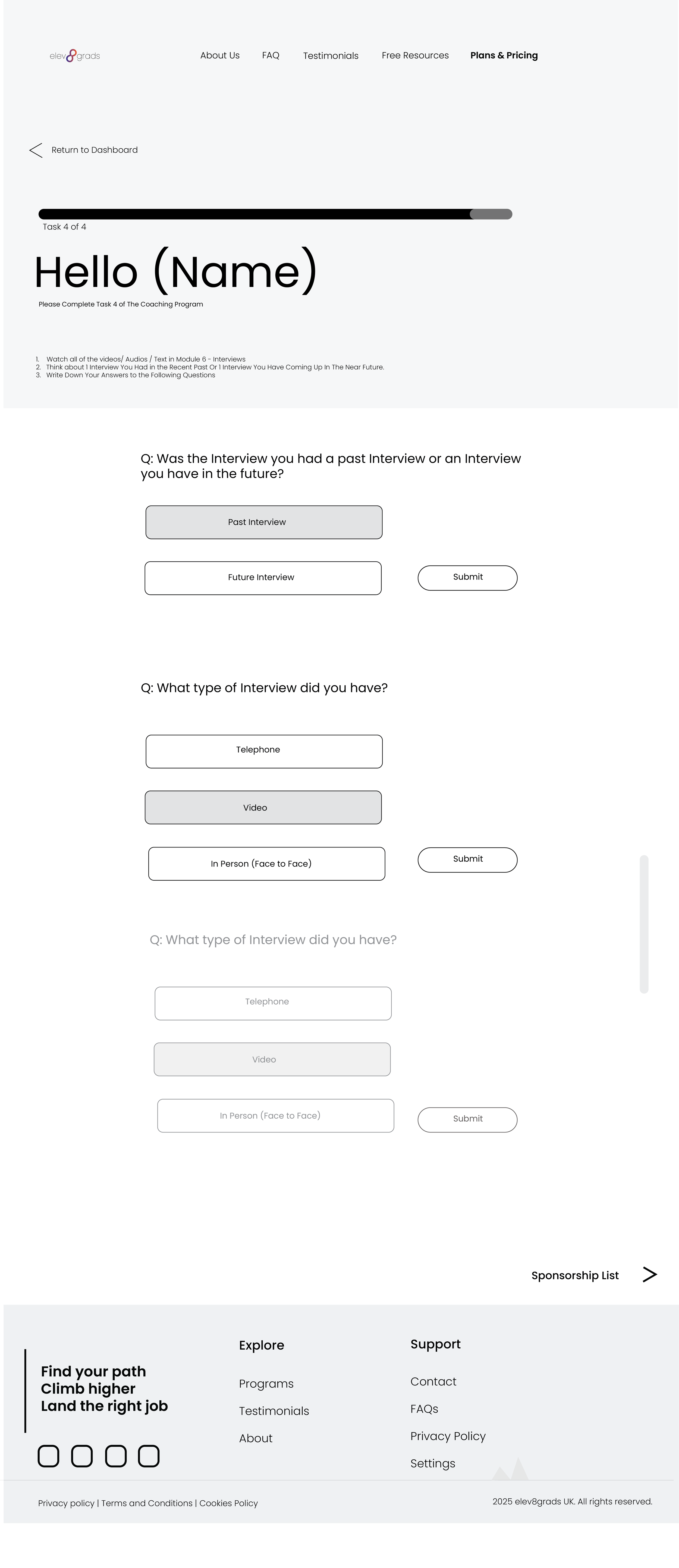
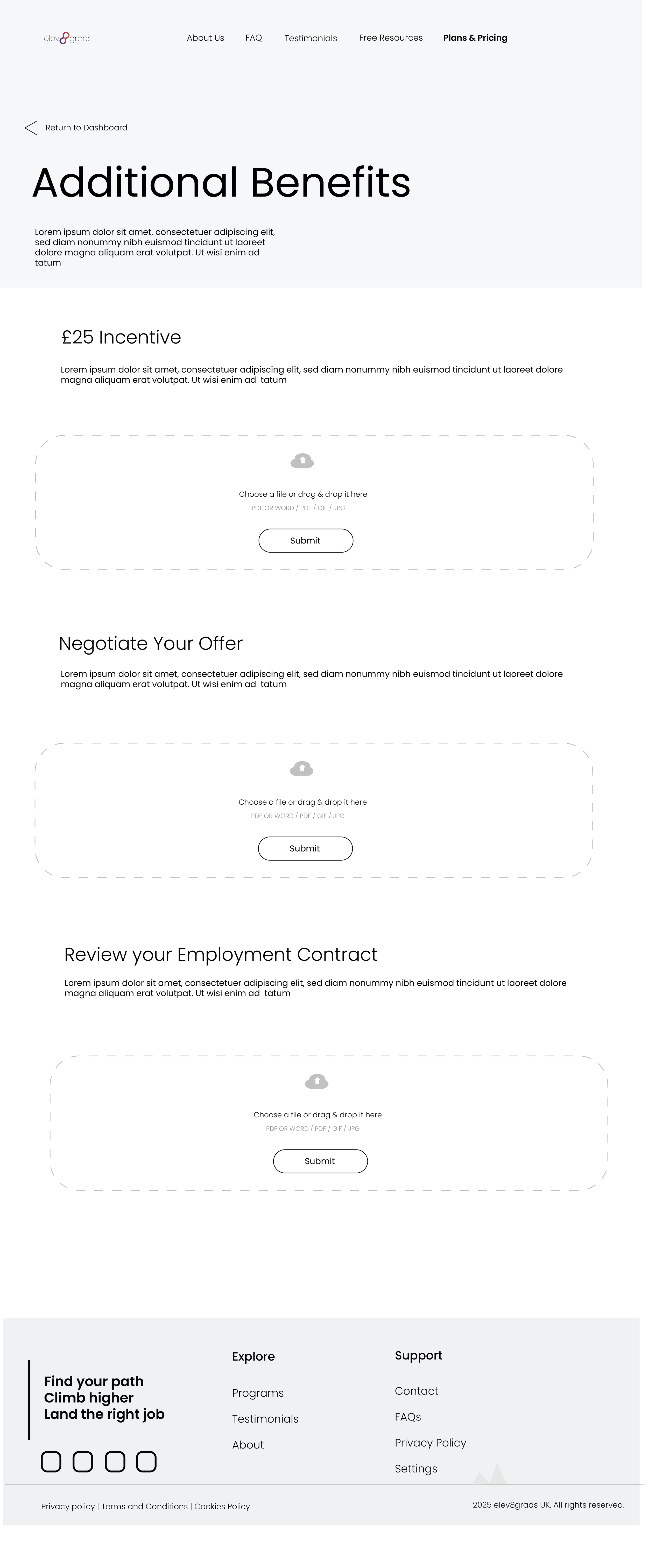
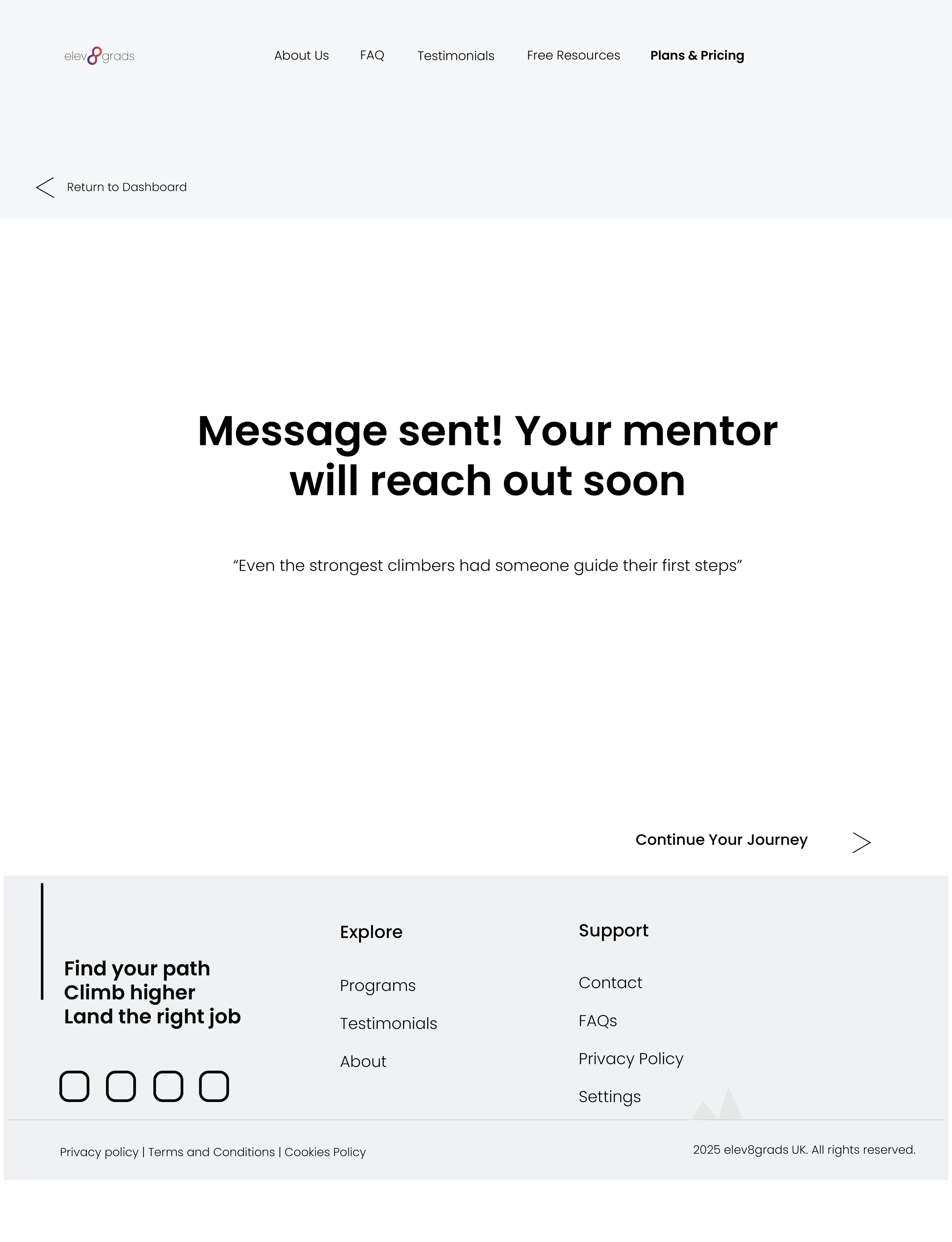
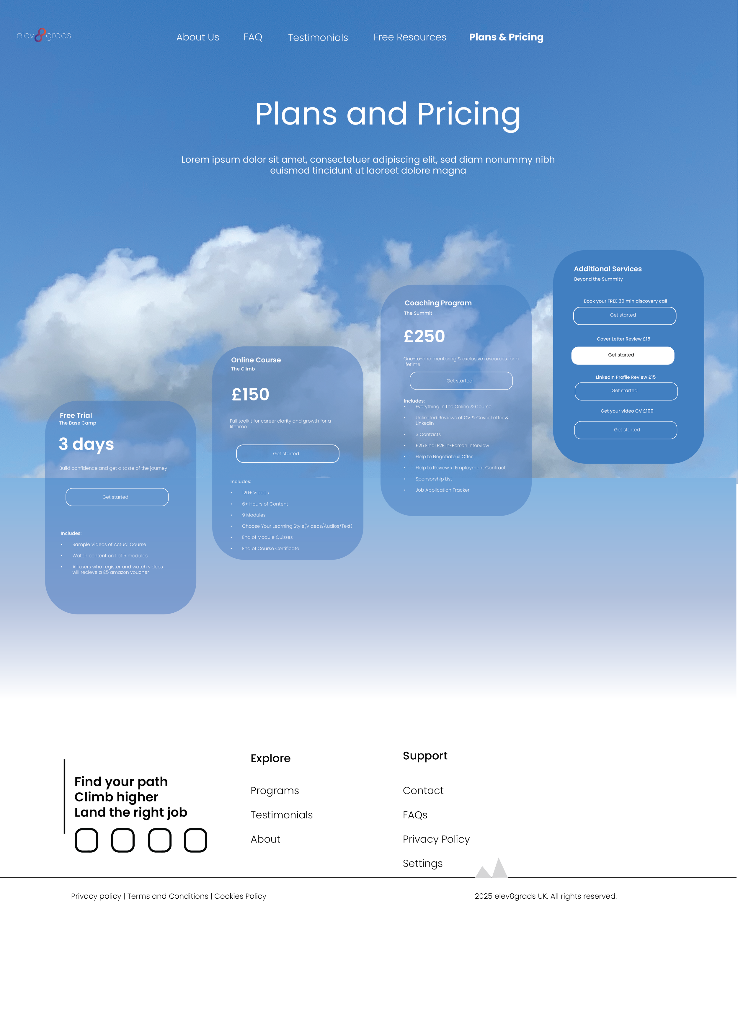
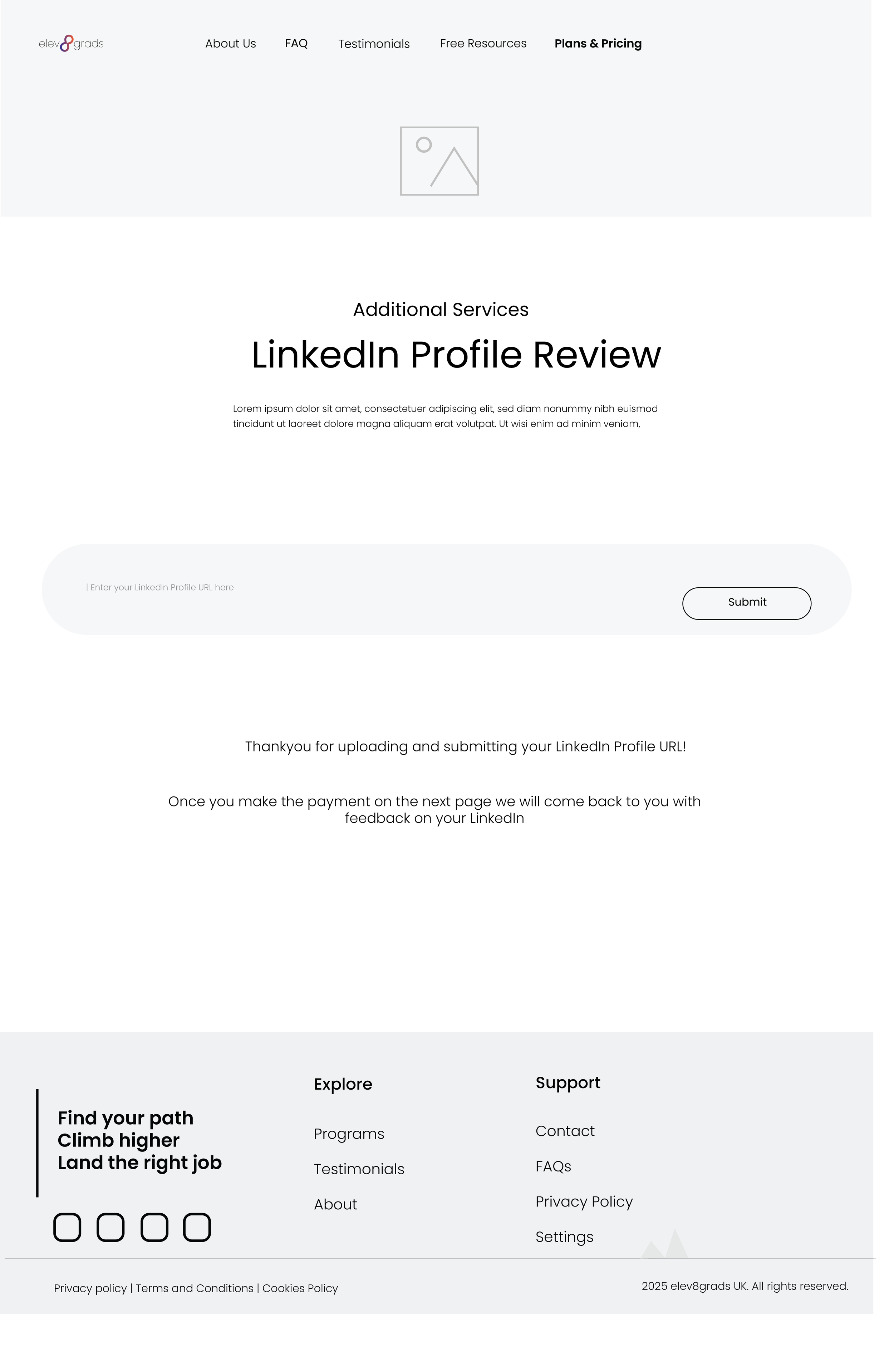
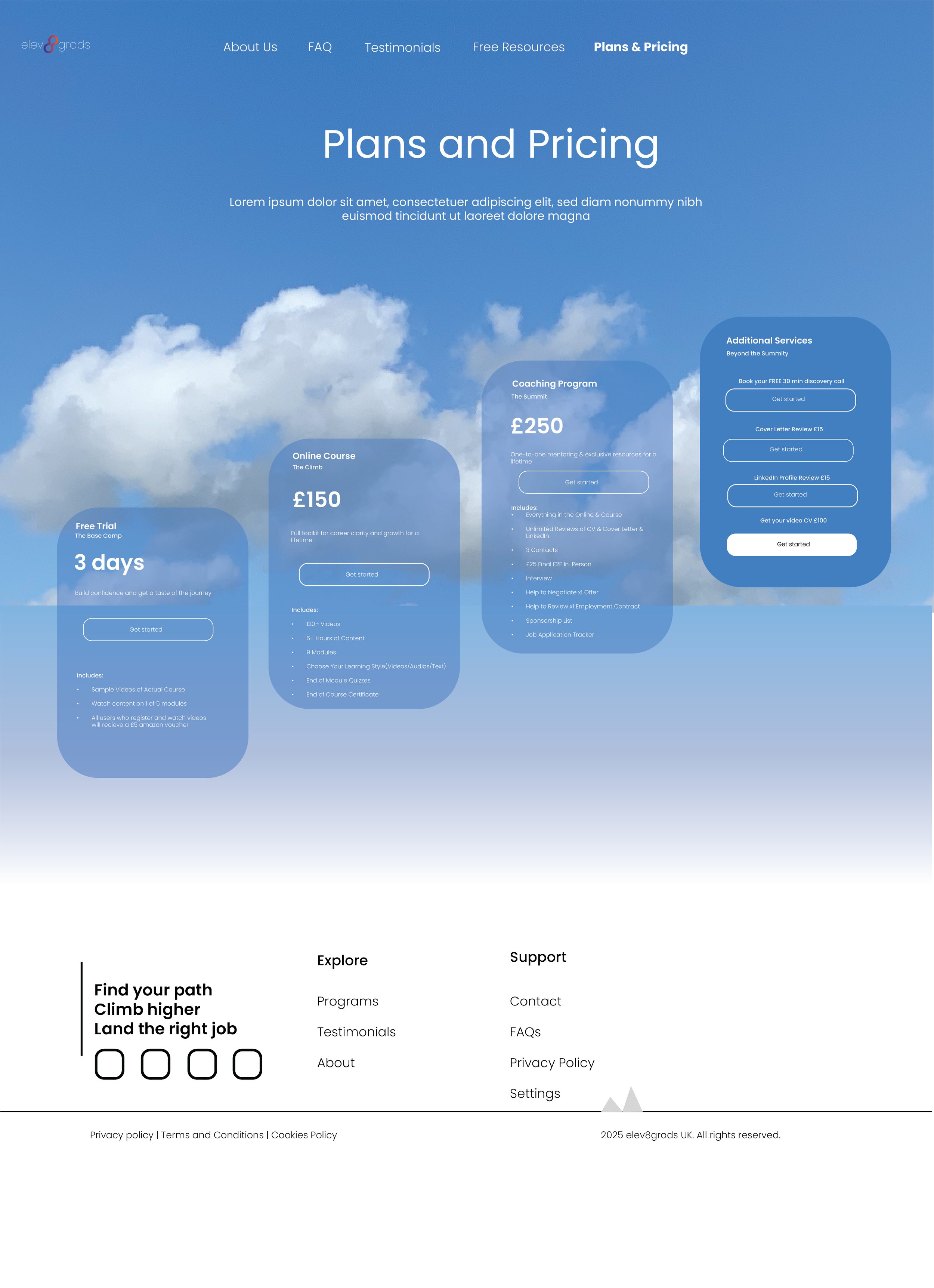
Wireframes
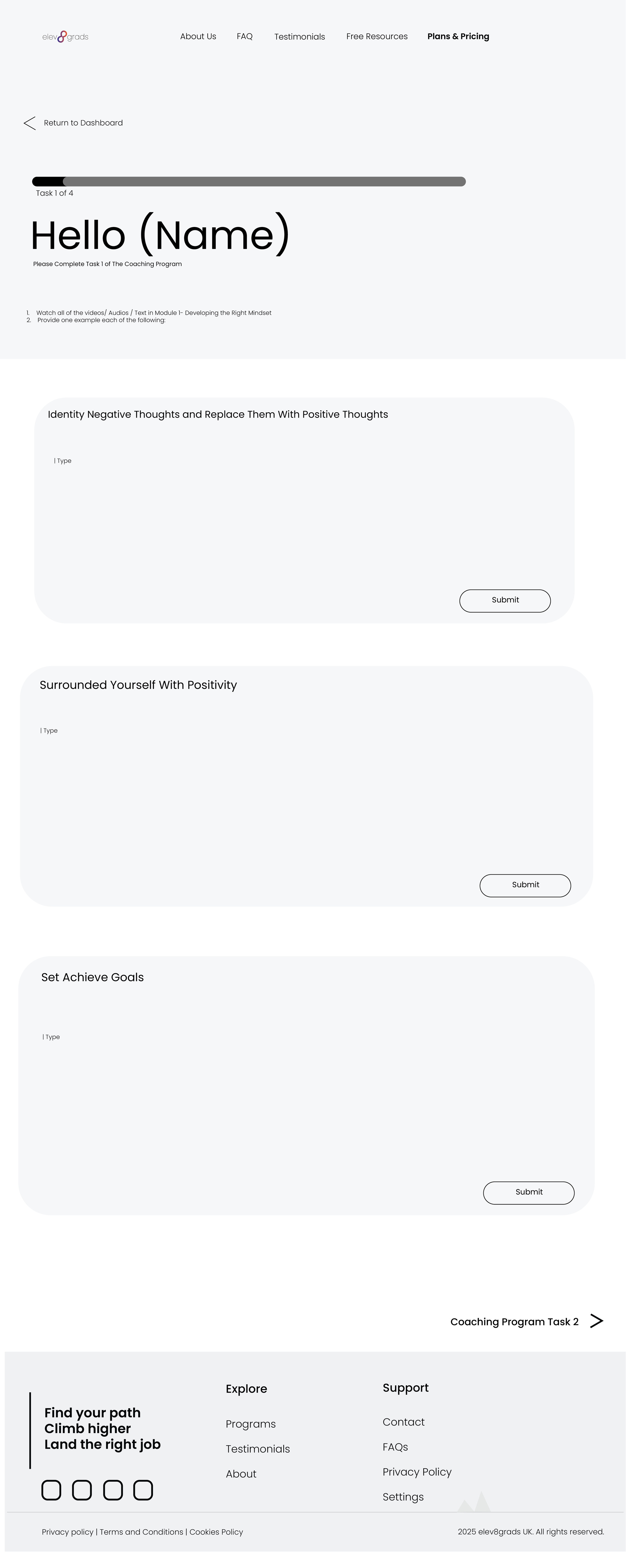
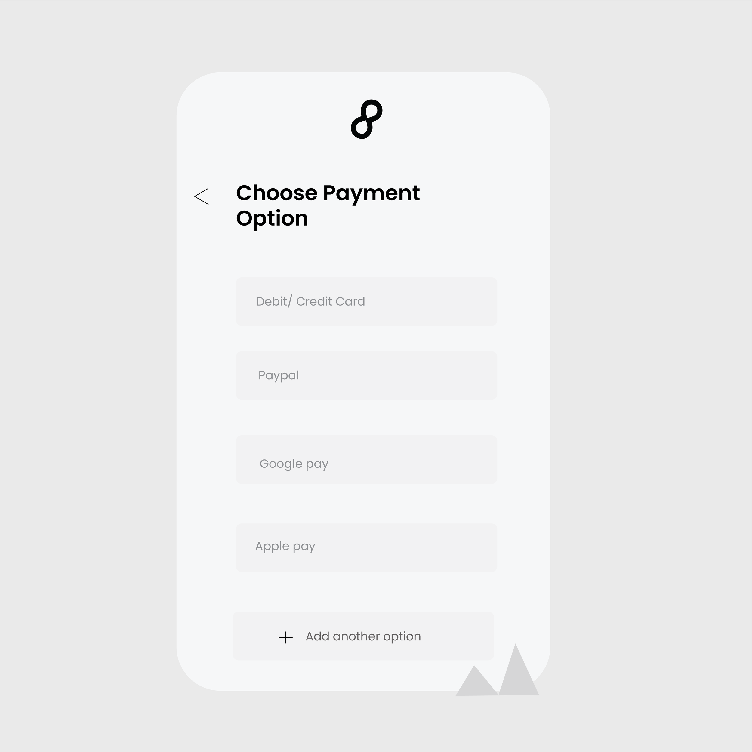
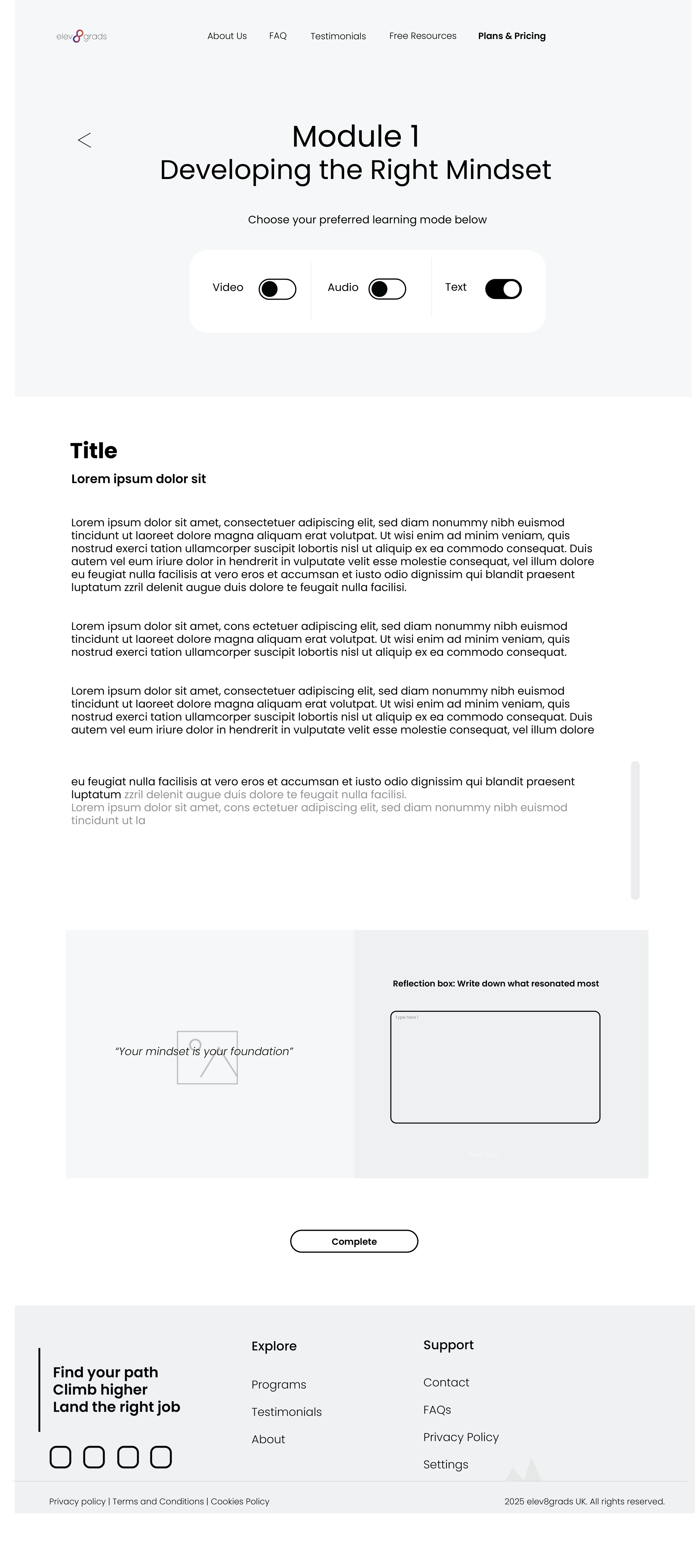
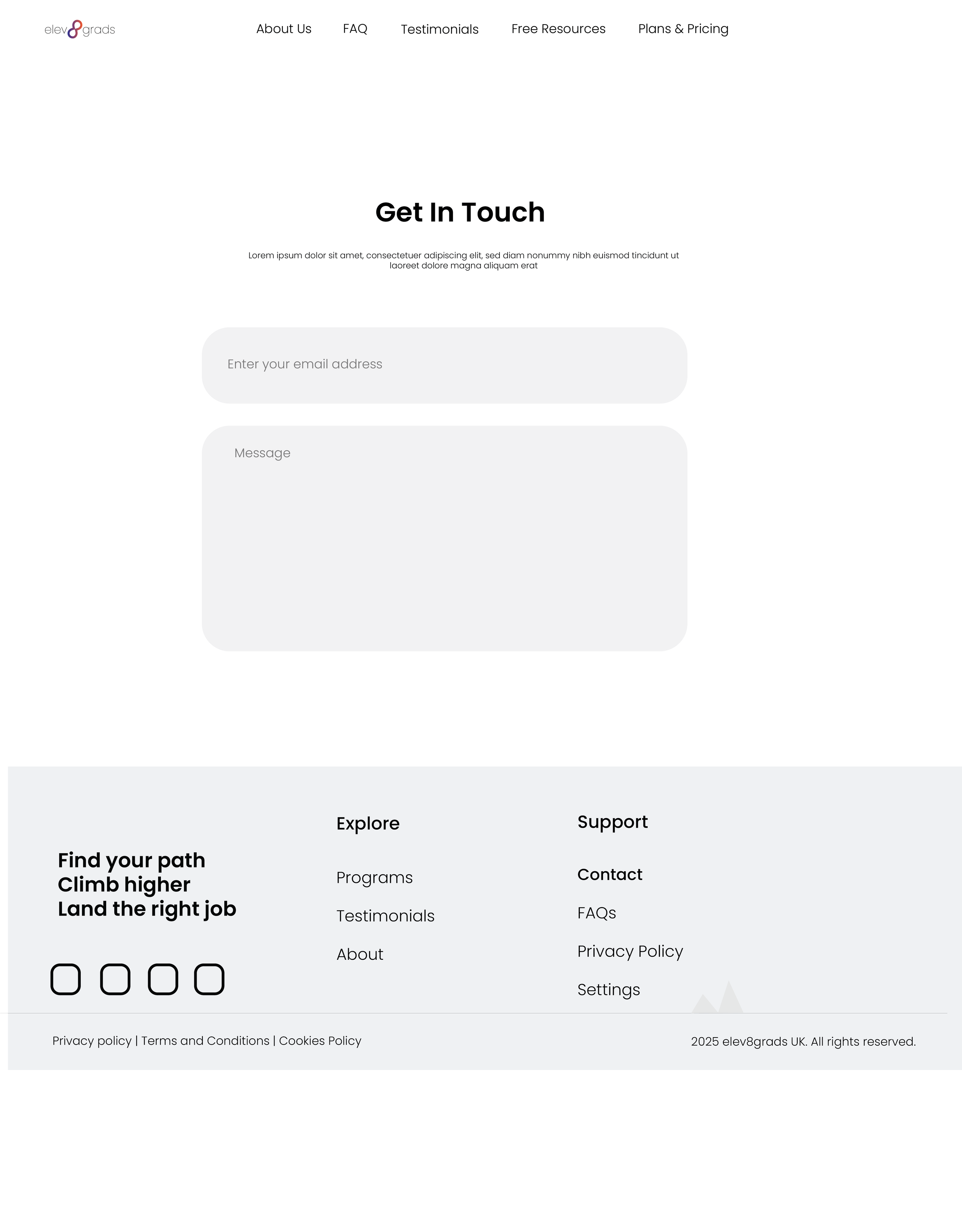
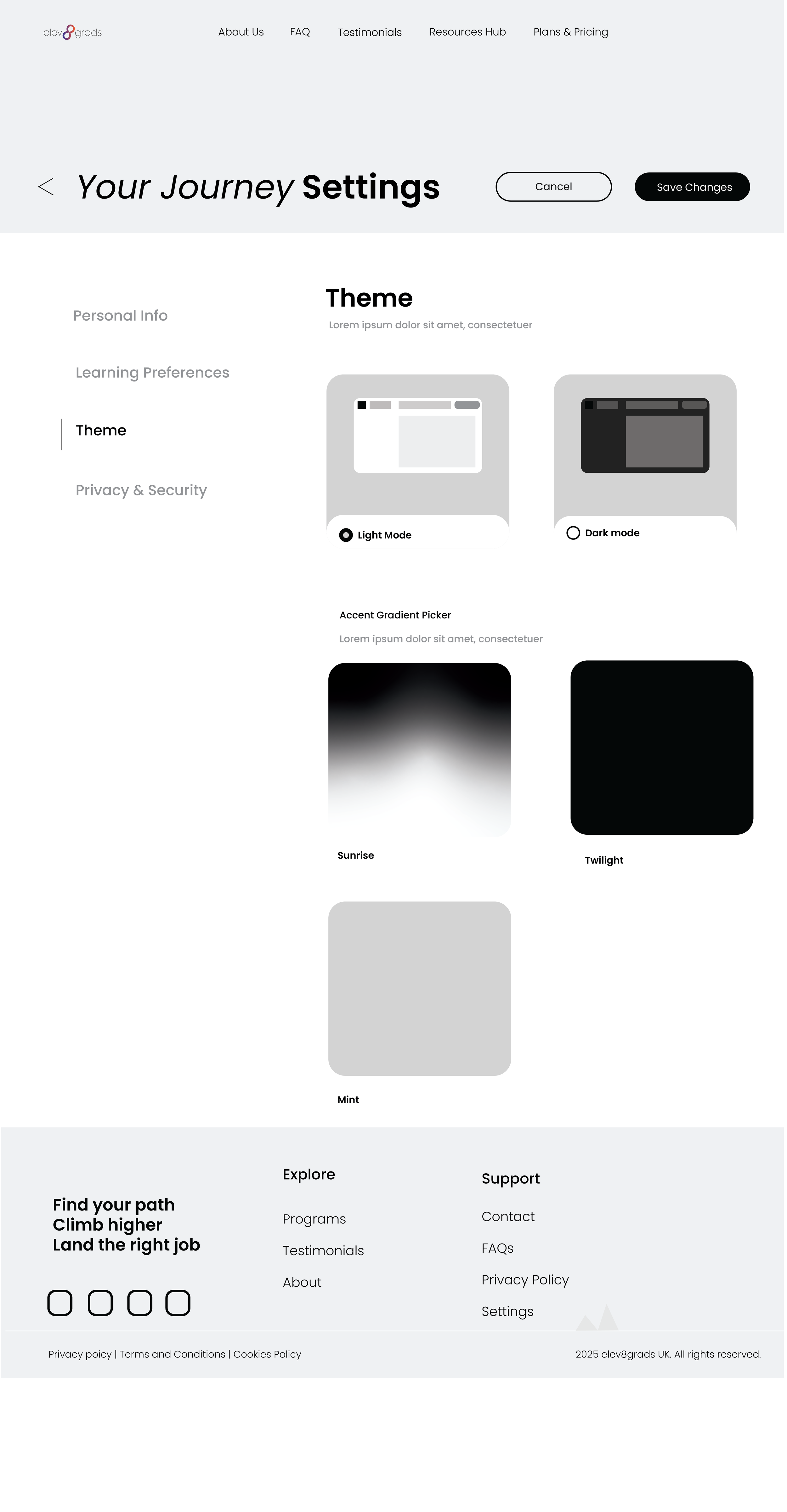
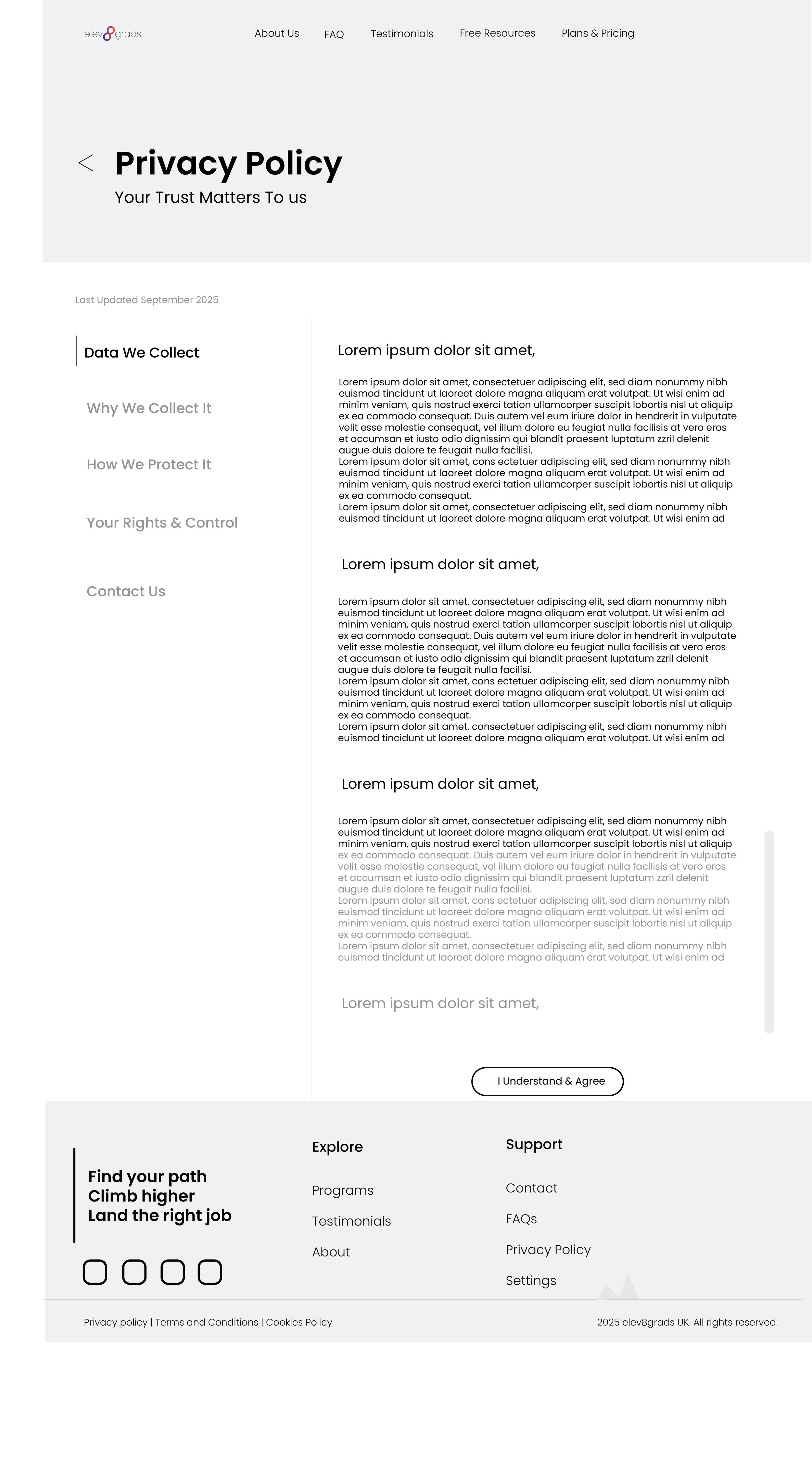
This was very new to me, but I decided to step out of my comfort zone and try creating wireframes for the client.
The wireframes show the user flow not just the visuals of each page. Each screen was designed for easy navigation, minimalism, a welcoming mood, intuitive and motivational using whitespace and consistent hierarchy to guide the user through their personal journey, I decided to create these wireframes for the web developers to look at and see what the client was envisioning on how the website should be and flow, then they can go ahead and make adjustments or changes if needed. So I was building the foundations and the web developers would paint the full picture for the client. The client just needed wireframes that can be shown and explained easily to them so I offered to create this for the client.
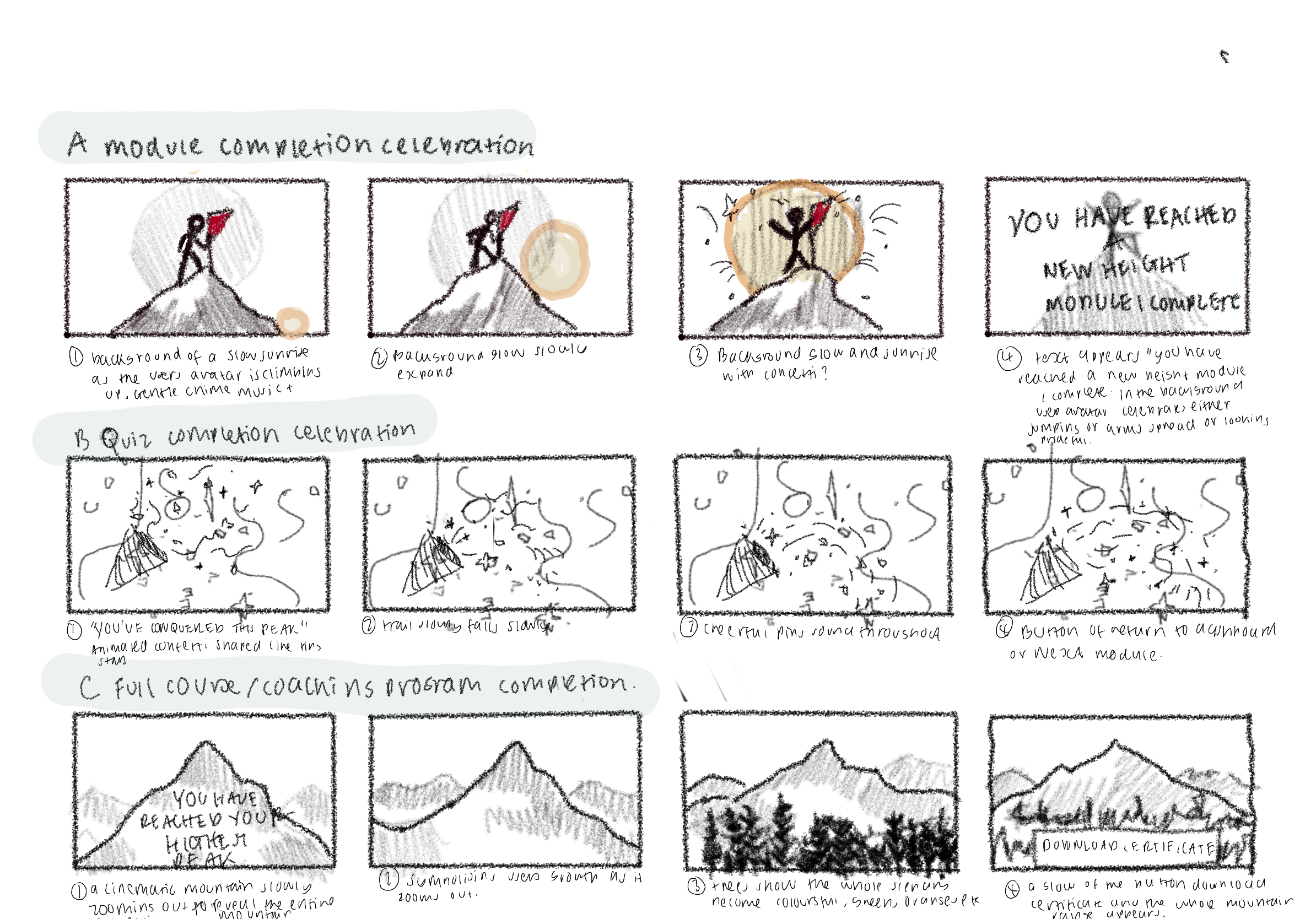
Micro-celebration animations
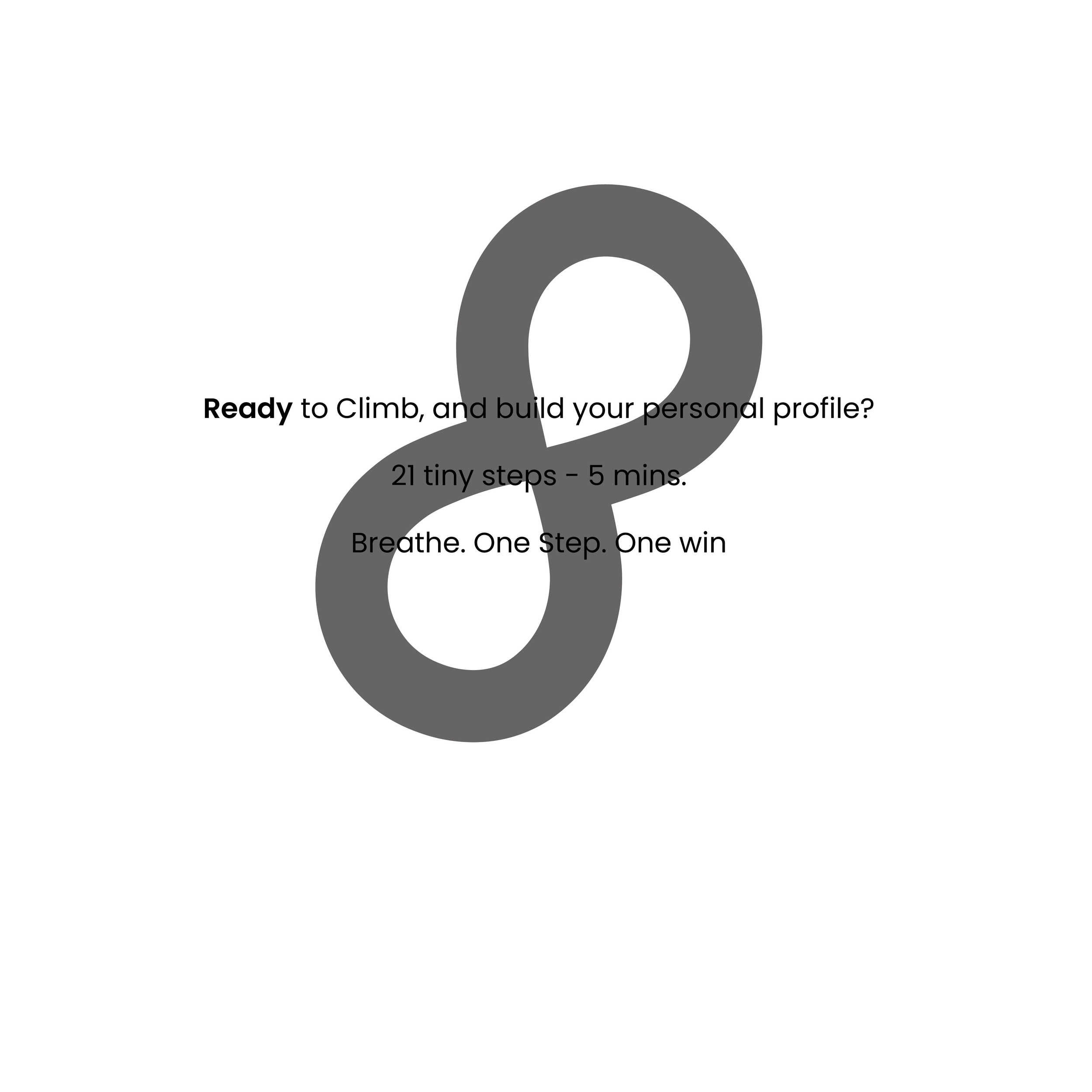
To improve on the users engagement through learning, I made a conceptual design of micro-celebration animation storyboard. Each animation was inspired by the mountain motif symbolising small but also meaningful milestones on the graduates journey. I created these storyboard frames to communicate visually my vision on how It should look and flow, from a flag planted on top of a peak after module completion to a panoramic sunrise animation celebrating course completion


