introduction
PEAK was born from a question I kept asking myself Why do non-alcoholic drinkers feel left out on a night out? The more I explored the mindful drinking movement, the clearer it became. Young people want to feel free, energised and included- without the needing alcohol to enjoy themselves. So I created PEAK a dual flavour shake to activate your peak with a bold personality and a storytelling led brand world
problem
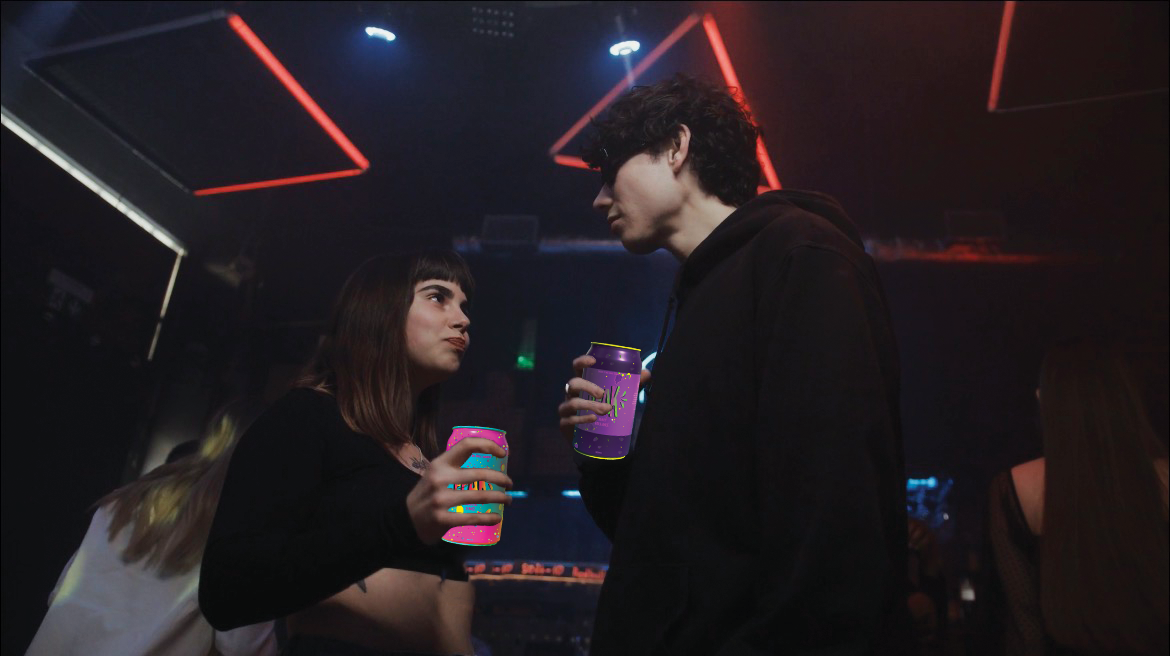
Nightlife excludes more people than it includes- especially the ones that don’t drink. Gen z craves bold, high energy experiences without needing alcohol, but current nightlife beverages feel uninspiring, sugary or boring, and they rarely reflect the chaotic expressive, identity-driven vibe of Gen z summer culture.
INSIGHT
For Gen Z, drinking is about feeling connected, not getting drunk. They want to turn up, feel seen, and stay energised- without compromising their values or vibe. they want drinks that look sick, feel good, and hit different, just like their music, fits, and friday night energy.
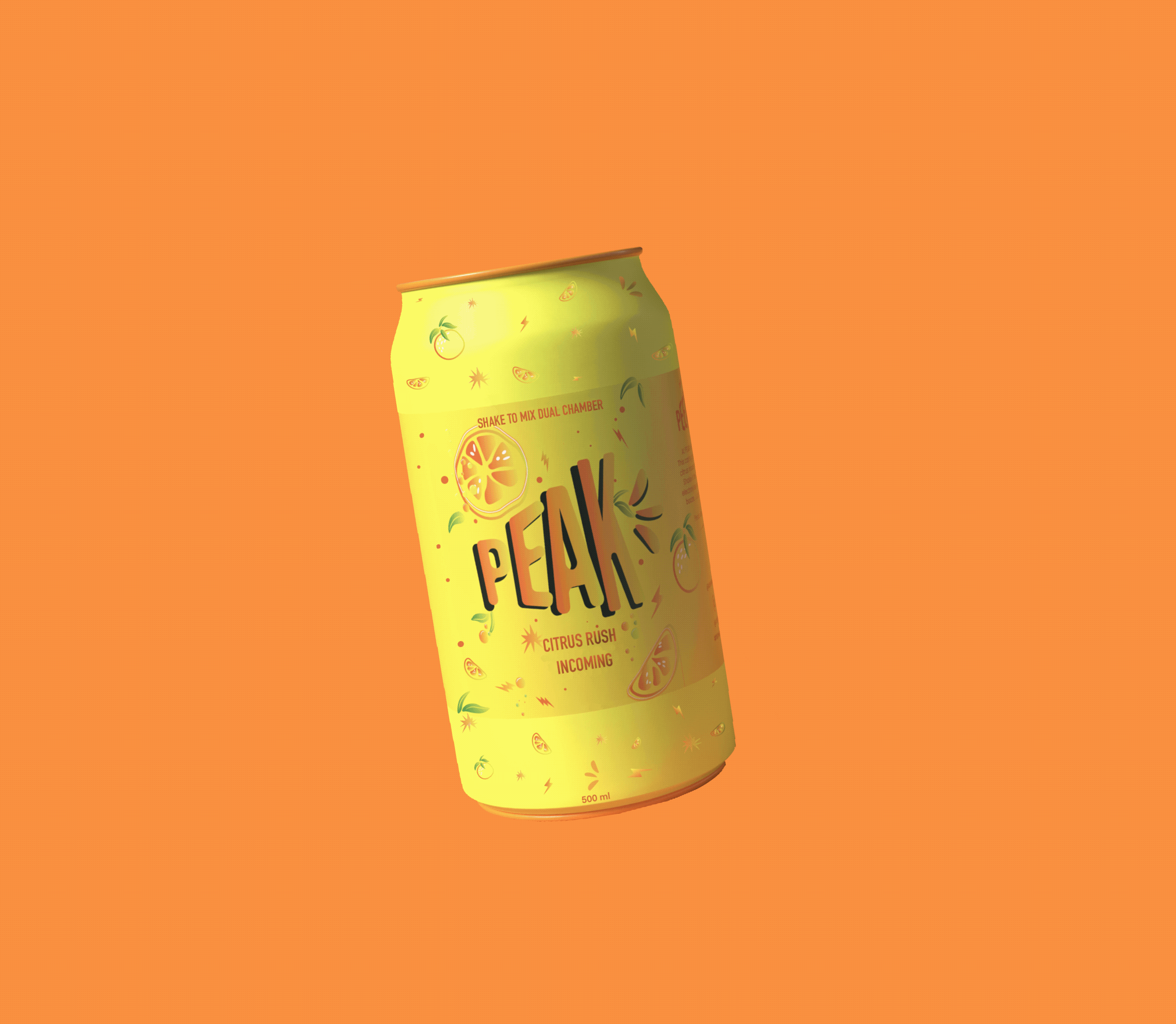
PEAK is a world-first, alcohol-free dual-flavour drink that activates when shaken. Built for Gen Z nightlife, it delivers bold flavour with electrolytes and vitamins for energy and hydration.
The experience extends beyond the can through the Call Box and PEAK Booth, creating spaces for discovery, connection, and shared moments.
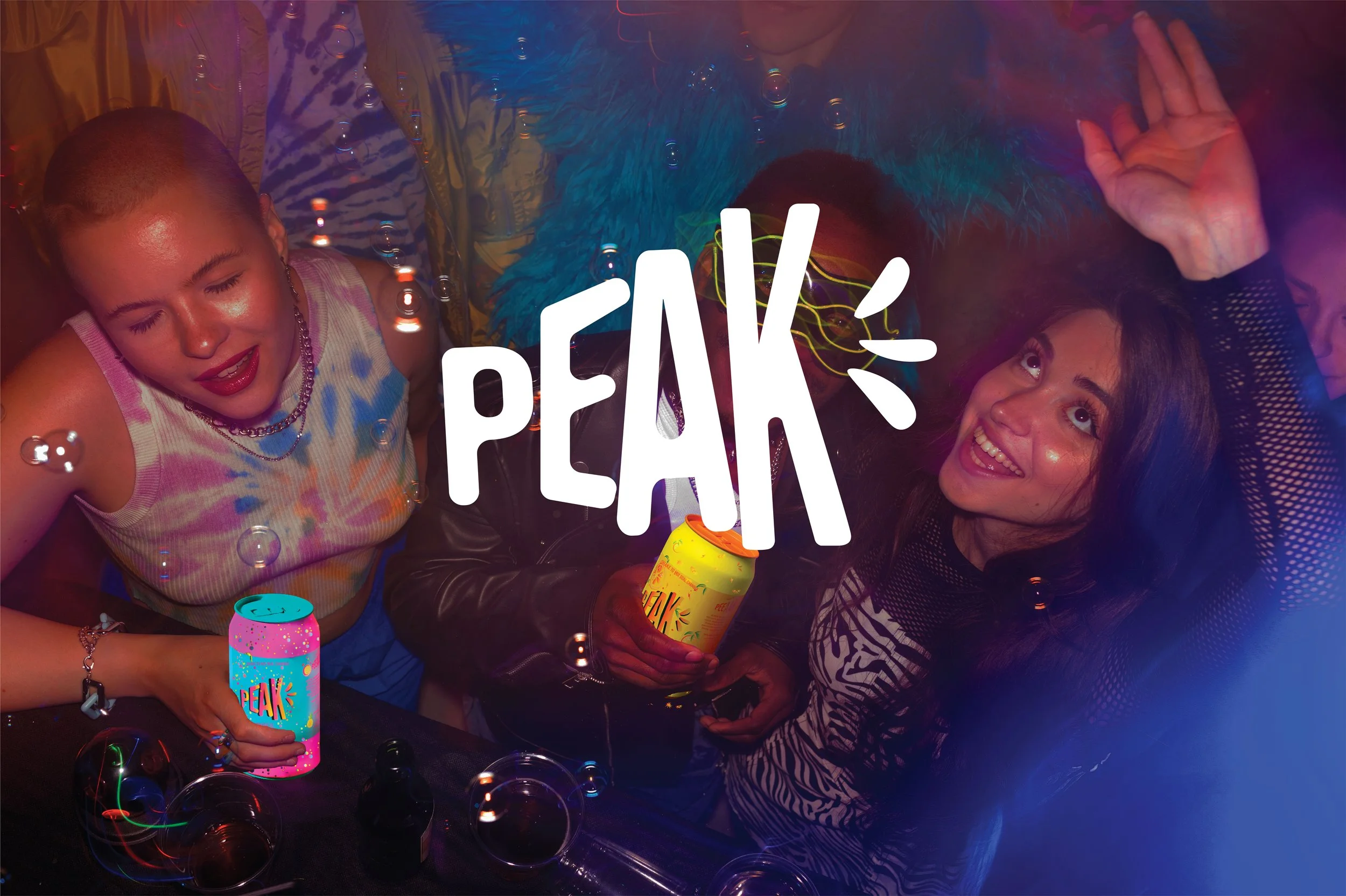
Shaking the can becomes a ritual — switching users from casual to charged. PEAK offers a high-energy, inclusive alternative to alcohol for summer nights.
LOGO
I designed the PEAK logo to resemble a megaphone, symbolising confidence and self expression. Also its suppose to representing progression of reaching to the top your peak. The splashes represent sound waves.
PEAK reworks the british phrase “that’s so peak,” transforming a negative phrase of a Gen Z saying into a bold statement of confidence and energy.
the ritual
A can designed to be activated not just consumed. The can has two liquid chambers each with its flavour and functional purpose. By shaking, switching and mixing the can. The drink transforms in the person’s hands. The ritual of reaching your peak is all about building energy, choosing when to activate it and releasing it in your own terms. The interaction creates anticipation, curiosity ad play elevating an experience beyond just opening the can.
Choose your peak
The flavours are not about just the taste it represents a different emotional peak state of a night out
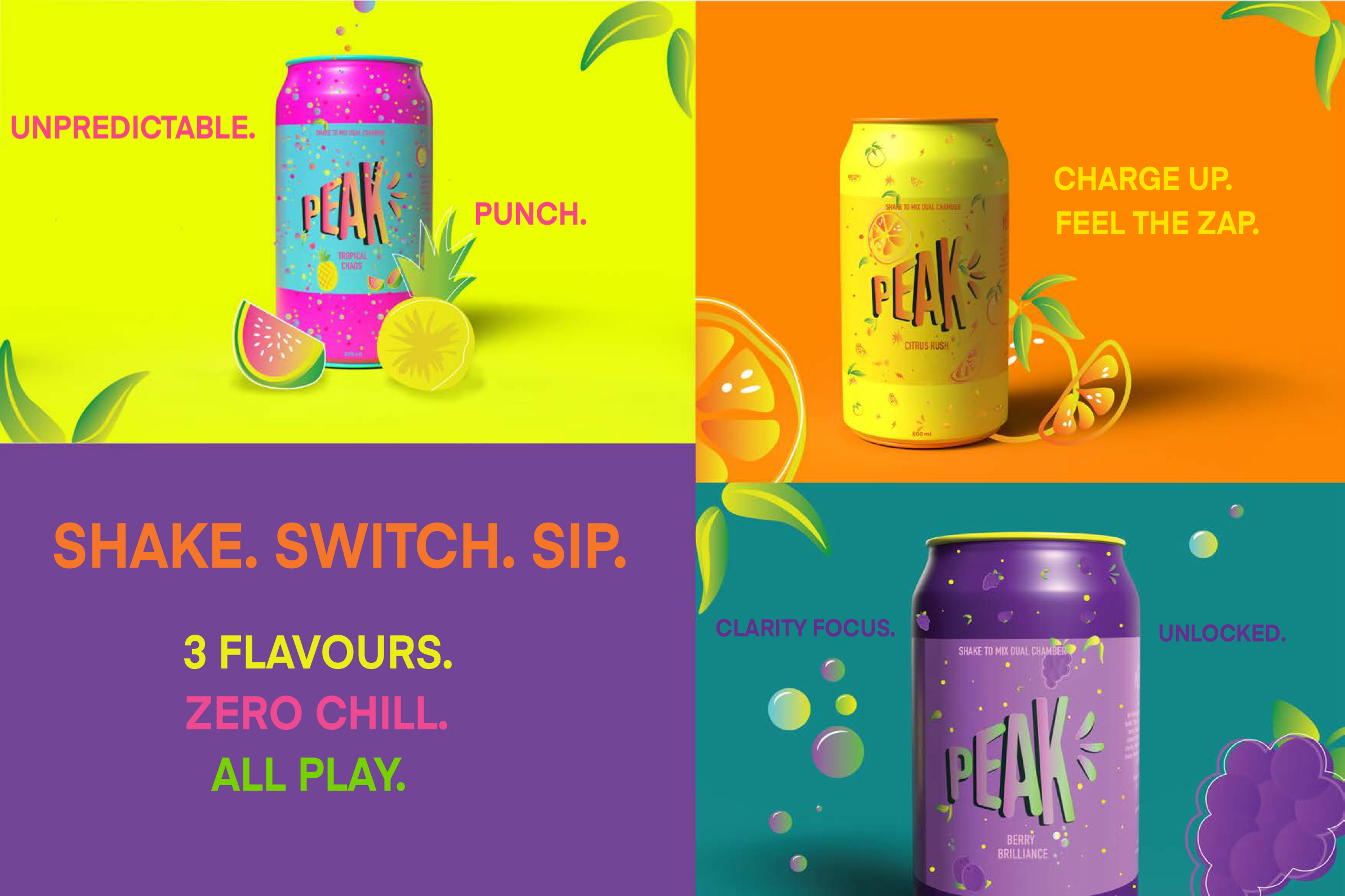
3 Flavours. 3 Emotional peaks.
PEAK, it’s not about replacing the alcohol, it’s about elevating the experience. Each flavour is designed to enhance how a night feels, not just how the drink tastes. Each one represents 3 emotional states of nightlife: Energy, Clarity and Chaos. CITRUS RUSH.
Emotional mode: Energy/ Ignition/ Kick-off
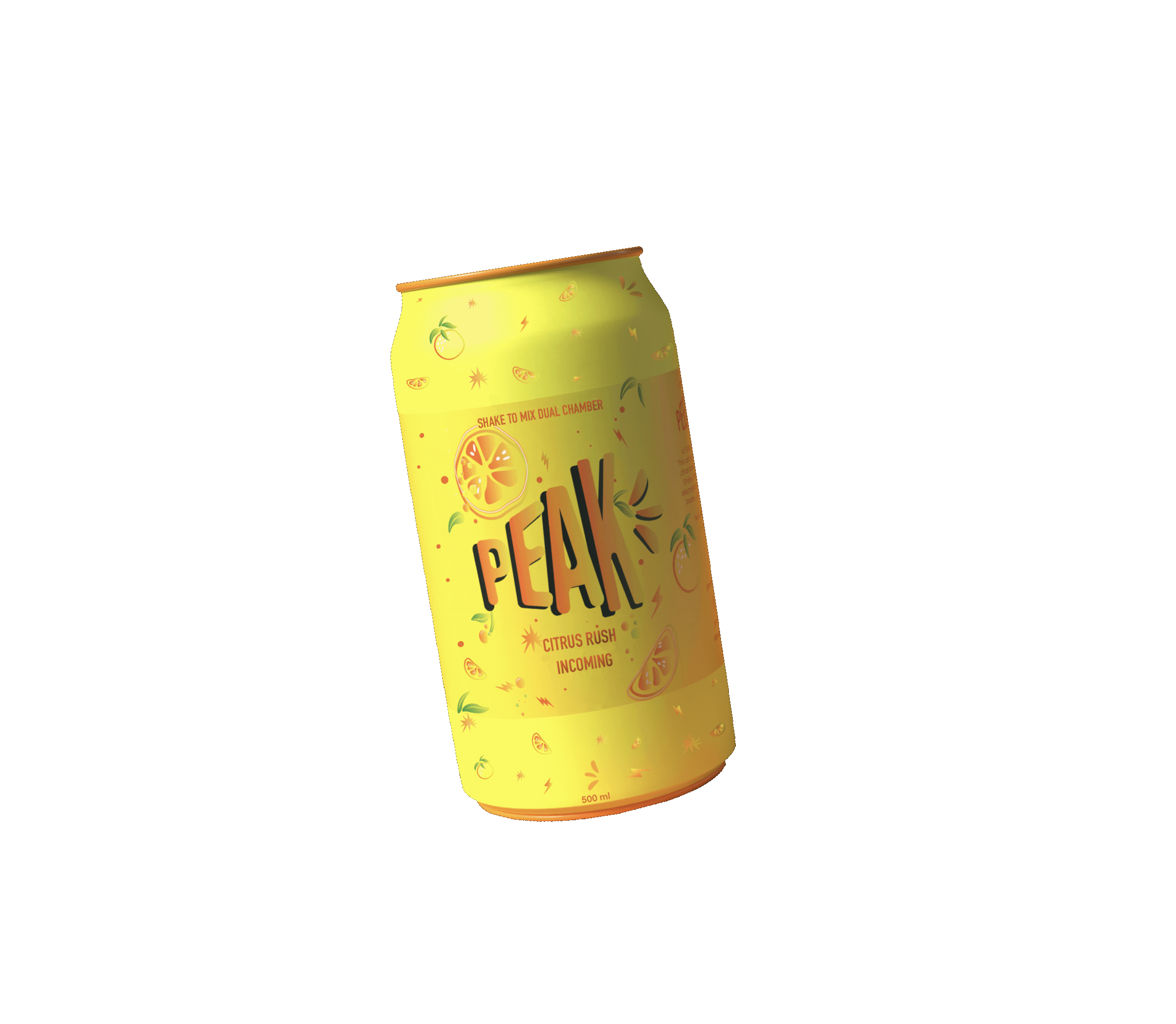
A sharp, zesty citrus hit designed to spark the night.
Fast, bright and unapologetic this is the moment everything starts moving
Designed to elevate music, atmosphere and connection, helping drinkers feel immersed, energised and included without alcohol
BERRY BRILLIANCE.
Emotional mode: Clarity/Focus/Confidence
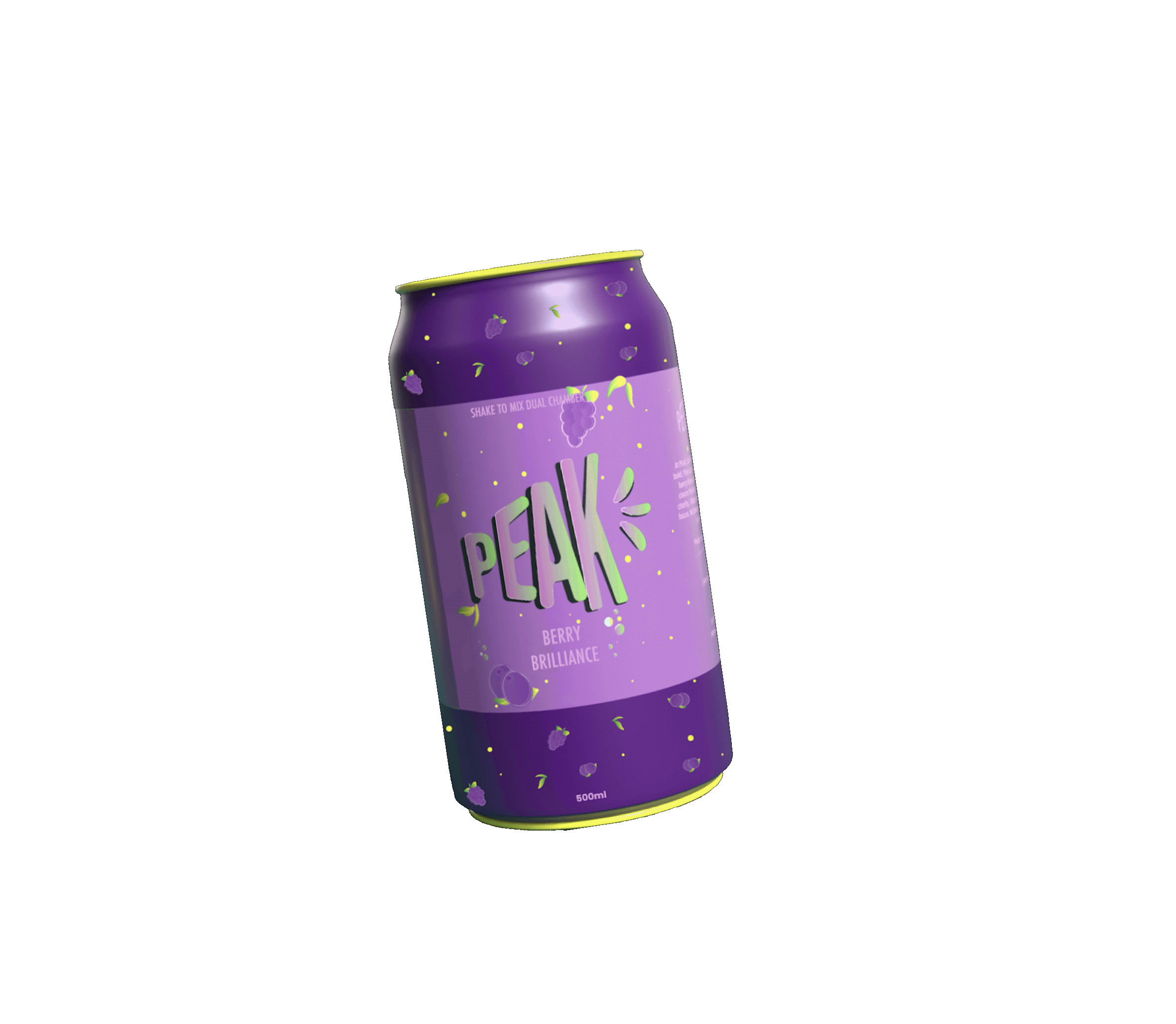
Bold berry flavours that cut through the noise.
A drink for staying present, thinking clearly, moving confidently and feeling switched
Designed to sharpen the mind while the night gets louder
TROPICAL CHAOS.
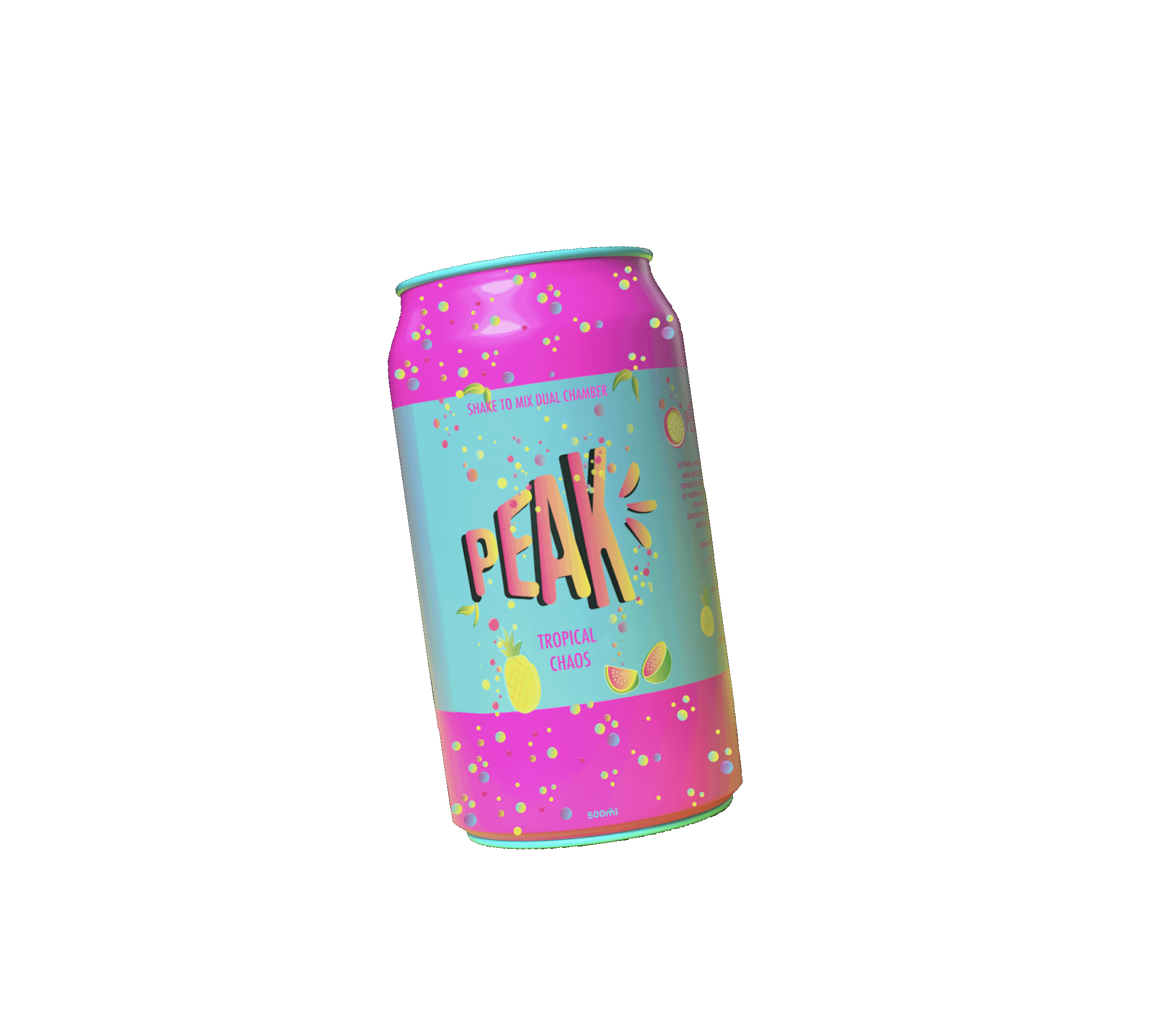
Emotional mode: Release/ Unpredictability/ Freedom
Sweet, wild tropical flavours with no rules attached. This is the moment you stop planning and start feeling.
Designed to embrace unpredictability when the night takes very and perfection disappears.
experiential brand activation
Rather than focusing on just the product. PEAK is introduced through an immersive nightlife experience through brand, space and a story.
The experience is through 2 connected physical touchpoints. Together they define PEAK not something you can just drink but something you enter feel and unlock. Each touchpoint representing a stage of progression giving it the idea of reaching a peak.
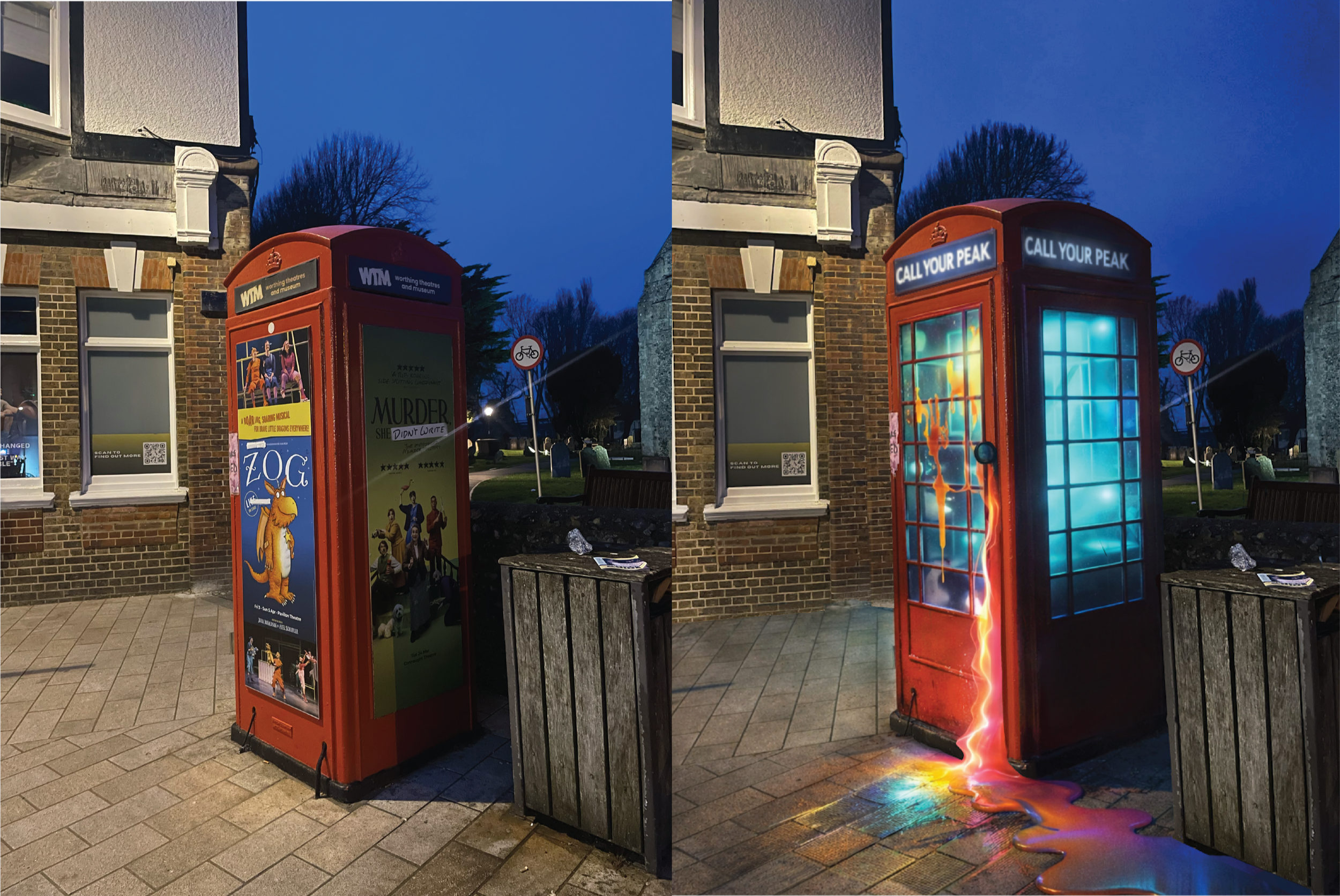
The Call box
Start point of the PEAK journey
Re-imagined British call box as the first immersive brand touchpoint a combination of nostalgia with futurism, it involves PEAK as an experience not a product, cracked, leaking and alive with energy, the call box sets the emotional tone of voice of raw, unfiltered and unpredictable. It invites users to follow the chaos(The liquid) and begin their progression towards PEAK.
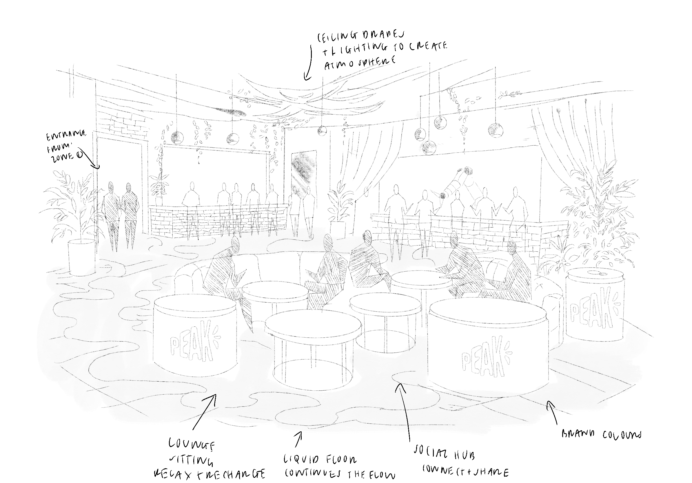
The booth
Activation and destination point of the PEAK journey
A high-energetic nightclub activation where the brand fully comes to life. Part vending machine, part performance, the booth transforms drink selection into playful shared moment. Robotic interaction, glowing colour and music driven atmosphere turn PEAK into a live brand statement not just something you drink, but something you experience together.
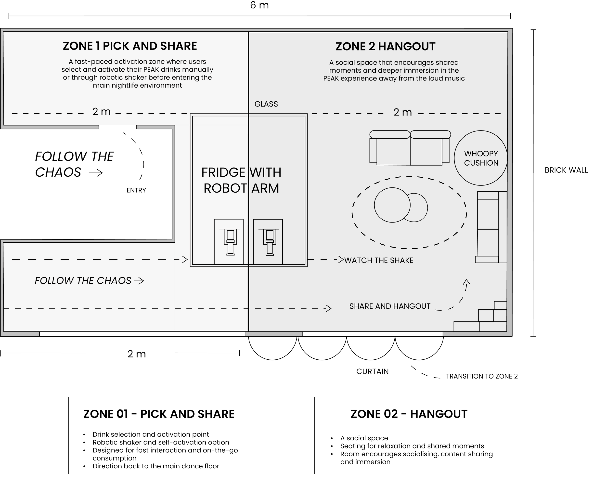
2D Floorplan
Spatial Journey & Interaction Flow
PEAK JOURNEY MAP
1.eNTRY
Follow the chaos2.acTIVATION
Robot/ self-shake3.chOICE
Flavour and control4.imMERSION
Sit. Watch. Share.5. pEAK
Collective Experience Spatial exploration sketches
Zone 1
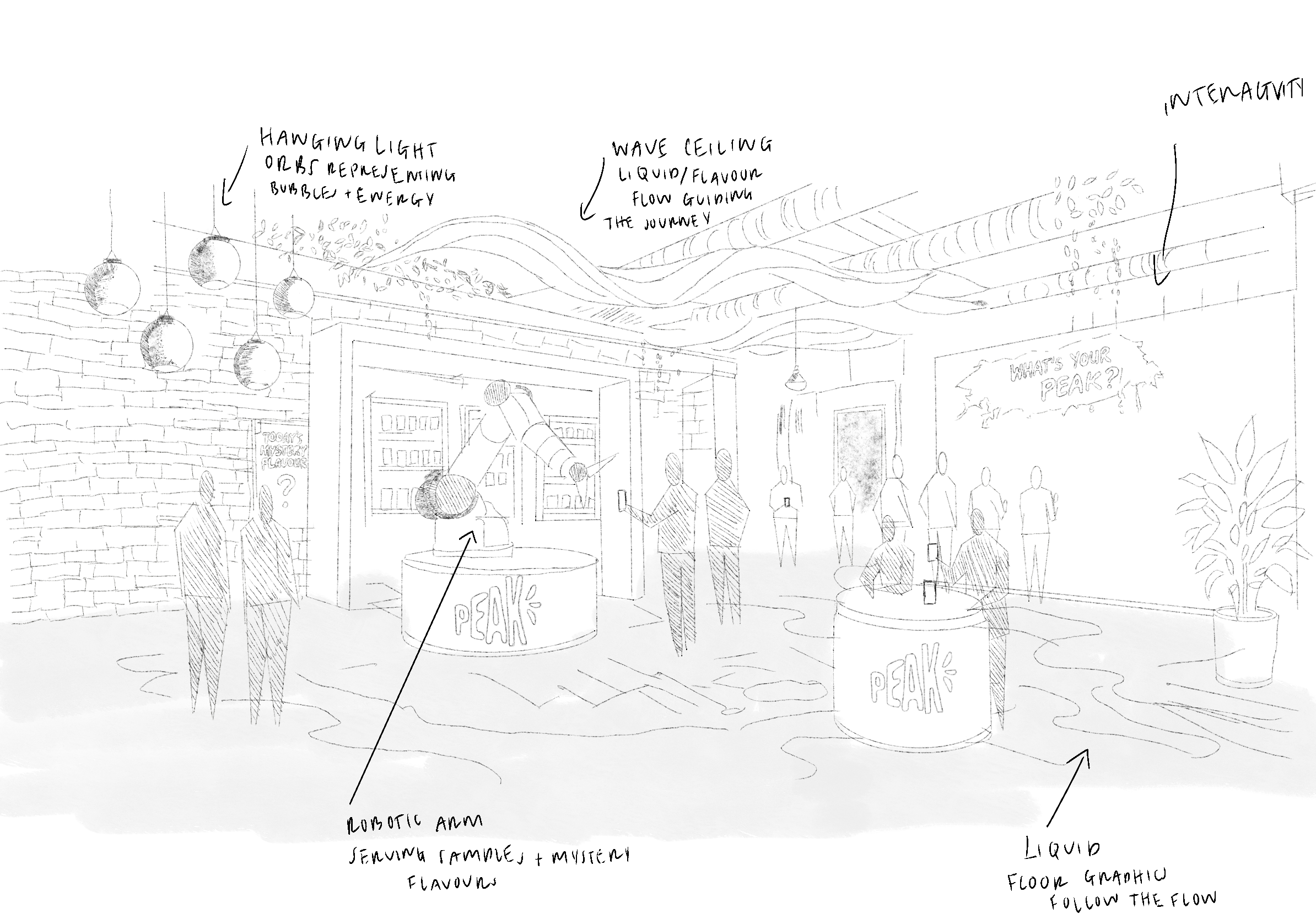
This showcases an open entrance just near the dance floor where people can freely choose their peak or be assisted by a robotic arm which activates the peak for your (shake, switch) the arrow is a direction of entry. It displays walls full of graffiti as part of participation from people the paint used glows in the dark and people are able to contribute. and their is a display of oozing liquid from the wall as well as the edges of the walls covered with dim LED lights.
Zone 2
This showcases a social immersive space for slowing down and connecting. Curtains that create seperation from the high-energy entrance, transitioning users to a more intimate environment. Central sofas shaped by the form of PEAK cans around a communal table. The robotic fridge allows drinks to be selected in the space, ensuring the continuing of the brand experience. Surrounded by textured brick with edges of dimmed LED lights, hanging plants and ambient lighting from hanging bubble lamps. The space is a blend of comfort in a playful immersion, inviting users to relax, socialise, take pictures and experience PEAK together.
Step 4 - Exit
Liquid trail leads toward the booth
Cracked surfaces and liquid leaks reflect emotional intensity and a combination of the drinks
Step 3 - Release
Step 2 - Listen
Voicemail-style audio introduces PEAK and “Follow the Chaos”
Step 1 - Enter
Private and enclosed space away from the crowd